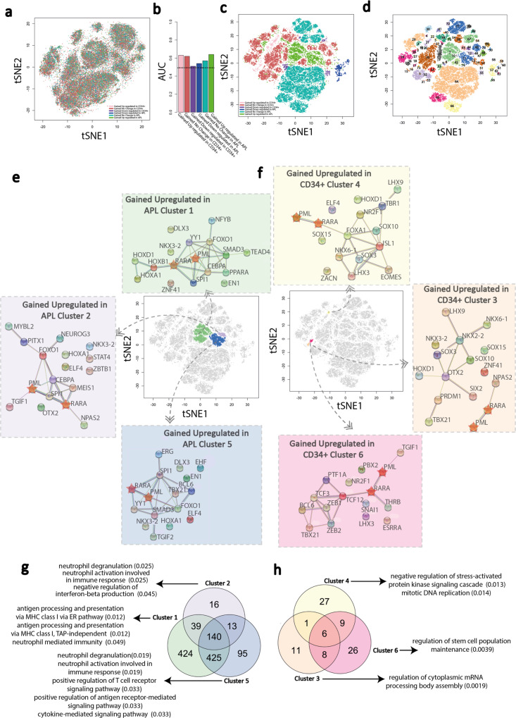
Fig. 7. Interrogation of the machine learning architecture applied to the APL patient vs CD34 + model.
a tSNE plot visualizing the clustering of ATAC-seq peaks based on motif composition similarities without machine learning interpretation. Each dot represents an ATAC-seq peak derived from CD34 + and APL patient samples and are colored according to the differential interaction/expression category to which the peak-containing fragment belongs: (pink, gained/upregulated in CD34 + cells; brown, gained/no change in CD34 + cells; purple, gained/downregulated in CD34 + cells; blue, gained/downregulated in APL patients; teal, gained/no change in APL patients; green, gained/upregulated in APL patients. b Bar plot showing the AUC scores for each APL patient vs CD34 + machine learning model. Dashed line (0.5) represents random predictions, and scores above that indicate predictive power. AUC = area under the curve. c tSNE plot visualizing clustering of ATAC-seq peaks based on the SHAPELY weighting derived from the APL patient vs CD34 + machine learning models. Each dot is colored according to the differential interaction/expression category to which the fragment containing the ATAC-seq peak belongs. d Identification of ATAC-seq peak clusters based on the SHAPELY weighting derived from machine learning. Each cluster is assigned a unique color using DBSCAN identified clusters; those points not assigned to a cluster are removed from the plot. e, f Protein–protein interaction network of TFs, which bind the top-15 predictive motifs in the gained/upregulated in APL patients cluster (#1, #2, and #5, green, purple, and blue, respectively) and in gained/upregulated in CD34 + cells cluster (#3, #4, and #6, orange, yellow, and pink, respectively). Circles are TFs and lines show known and predicted physical interactions between them, as identified by the STRING database. PML and RARA are denoted as stars. Each plot centers around the tSNE plot highlighting clusters to which each network refers. g, h Three-way Venn diagrams showing the overlap of genes associated with the fragments within the three clusters depicted in (e, f) for the gained/upregulated in APL patients cluster (#1, #2, and #5, green, purple, and blue, respectively) and in gained/upregulated in CD34 + cells cluster (#3, #4, and #6, orange, yellow, and pink, respectively). The top enriched gene ontologies—determined using the EnrichR online tools reported enrichments—associated with each gene set is highlighted with an arrow—only those with an adjusted p value < = 0.05 are shown. Source data are provided as a Source data file.

