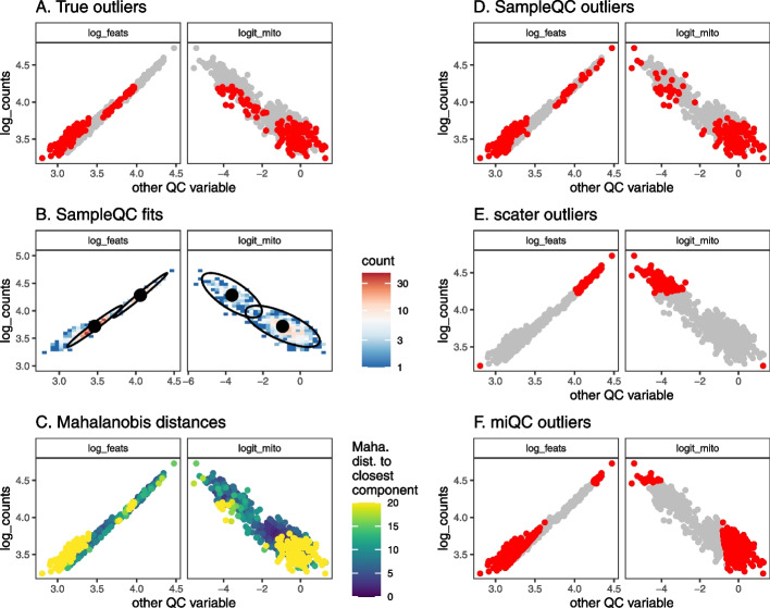
Fig. 2.
QC method comparisons on multimodal simulated data. A Biaxial plot of QC metrics for one simulated sample. Each point represents the QC metrics for one cell, with (known) simulated outliers in red and non-outliers in gray. B Multivariate density plot of data in A, annotated with models fit by SampleQC. The distinct clusters here are examples of what we term “QC cell types,” i.e., cells with similar distributions in their QC metrics, although their gene expression distributions may be distinct. C Mahalanobis distances to nearest cluster under the fit SampleQC model, with large values indicating low likelihood under multivariate Gaussian mixture model. D, E, F Outliers detected by SampleQC, scater, and miQC, respectively. These indicate the different assumptions on outliers made by the different methods: SampleQC calls droplets in low-density regions of the QC metric space as outliers; scater calls droplets with extreme values on at least one metric as outliers, in effect drawing a box around the central mode of the data; miQC identifies droplets with high mitochondrial proportion relative to the number of features observed, which may correspond to a good quality cell type with high mitochondrial proportion

