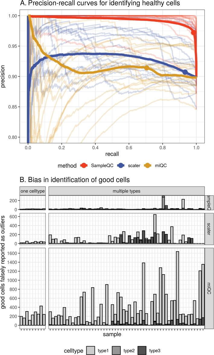
Fig. 3.
Performance comparison of SampleQC , scater, and miQC on simulated data. Results from a simulated experiment of 100k cells with 3 QC cell types. A Precision-recall curve of identification of “good” cells. Solid lines show curve calculated over all cells. Transparent lines show curves for individual samples. Dots show default exclusion thresholds for each method ( Chi-squared likelihood under fitted model for SampleQC; MADs for scater; posterior probability of compromised cell for miQC). B Bias in number of cells reported by sample, samples split by whether one or multiple QC cell types present in the sample (i.e., whether samples is uni- or multimodal). y-axis is bias in reporting of good cells

