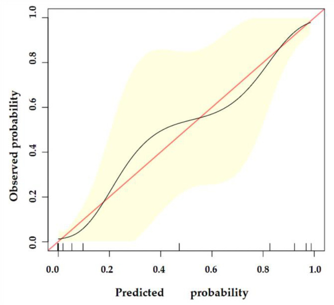
Figure 8.
The calibration curve of our model. The y-axis represents the actual probability of breast malignancy, and the x-axis represents the observed probability. The red line represents the perfect prediction of an ideal model. The black line represents the predictive performance of our model, and the yellow shaded area represents our model’s 95% CI. Our model demonstrates good consistency between predicted and actual probabilities.

