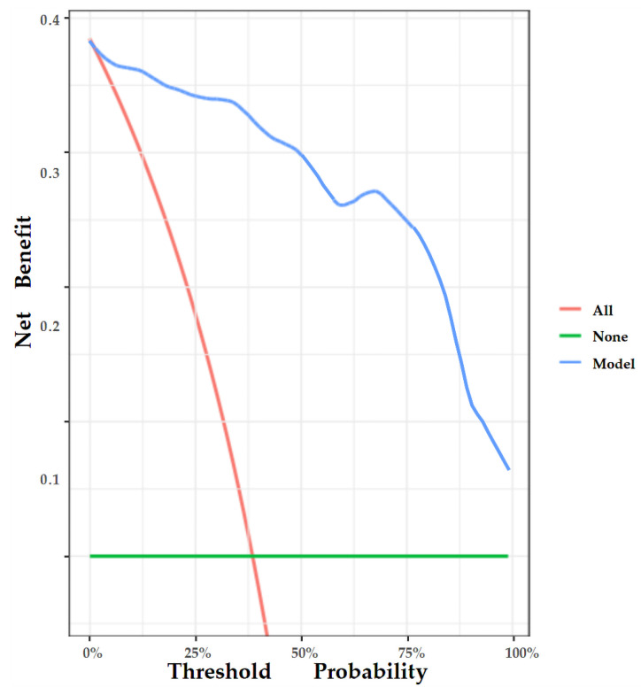
Figure 9.
DCA of the nomogram. The y-axis represents the net benefit, and the x-axis represents the threshold probability. The red line represents the assumption that all patients tested positive and were all tested. The green line represents the assumption that all patients tested negative and all were not tested. The blue line represents the net benefit of our model as the threshold probability changes. It shows that our model can benefit patients with breast lesions across a considerable threshold range.

