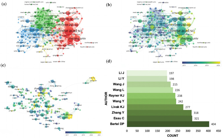
Figure 4.
Visualization graphs of contributors. (a) Network visualization of institutions involved. (b) Overlay visualization of institutions. (c) Overlay visualization of authors. (d) Top 10 cited authors ranked by citations. (a) The main institutions were classified into four clusters, presented by four colors (red, blue, green and yellow). Node size indicates a publications’ number of institutions. The lines between nodes represent the cooperative relationships among organizations, the thickness of which shows the link strength between two nodes. (b,c) Different colors show the year of publication for each node.

