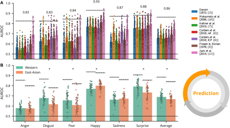
Fig. 3. Prediction results.
(A) Color-coded bars show the average AUROC score for each model (see legend at top) for each emotion separately. Dots represent the model predictions of each individual participant. Dashed lines represent the noise ceiling with specific values shown above (gray area represents ±1 SD based on bootstrapping repeated observations, see the “Noise ceiling estimation” section). The black solid line at the bottom represents chance performance (AUROC = 0.5). (B) The same AUROC scores are averaged across models and presented by culture. Asterisks indicate a significant AUROC score difference (P < 0.05; two-sided independent t test) across cultures.

