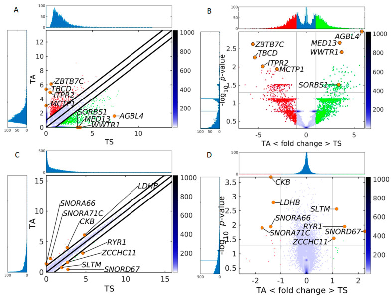
Figure 3.
Comparison of the sensitivity of circulomics and transcriptomics data from SkM to detect differences between sedentary and active individuals. (A) Pairwise scatter plot and (B) volcano plot of circulomics data from tissue sedentary (TS) and tissue active (TA). (C) Pairwise scatter plot and (D) volcano plot of RNA-seq data from TS and TA. In all plots the color bar indicates the scattering density. Darker blue color corresponds to higher scattering density. In the scatter plot the up-DPpGCs in the TA samples (ordinate) are shown with red dots, and up-DPpGCs and DEGs in the TS samples (abscissa), with green. Several gene positions are shown as orange circles. The levels are log2-scaled. The histograms visualize the eccDNA production and gene expression spectra.

