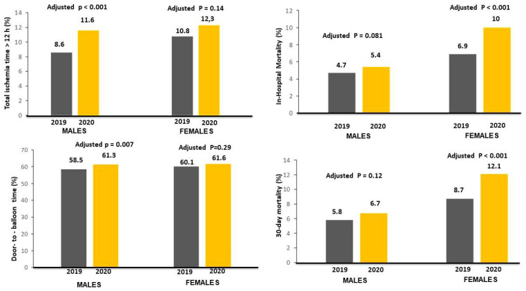
Figure 2.
Bar graphs on the left side show the association between the year of intervention and time delays (ischemia times longer than 12 h in left upper graph; door-to-balloon times longer than 30 min in left lower graph). Bar Graphs on the right side show the association between the year of intervention with in-hospital (right upper graph) and 30-day mortality (right lower graph) rates.

