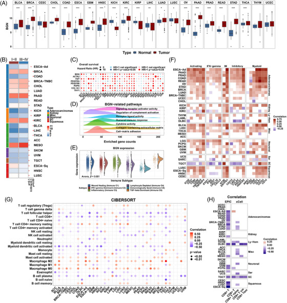
FIGURE 6.

Clinical and tumor microenvironmental relevance of biglycan. (A) Boxplots comparing BGN expression between normal and cancer tissues from the merged TCGA‐GTEx cohort. Normal and tumor are represented as blue and red. p value from Student's t‐test. (B) Heatmap showing BGN expression in stage I–II and stage III–IV patients. p value from Student's t‐test. (C) Bubble plot showing the hazard ratio for BGN and classic CAFs markers analyzed by univariate Cox regression model. (D) Density plots showing Gene Ontology enrichment. The frequency (y‐axis) of enriched gene counts in cancer is shown. (E) Violin and dot plots showing BGN expression in immune subtypes of the TCGA cohort. p value from one‐way ANOVA test. (F) Heatmap showing the correlation between BGN and immune‐related genes. Correlation values without statistical significance are represented as blank. (G) Bubble plot showing the correlation of BGN expression and CIBERSORT LM22 immune cells. (H) Heatmap showing the correlation of BGN expression and CD8+ T cell infiltration calculated by EPIC and xCell algorithms. Positive and negative correlations are represented as red and blue. p value from Spearman correlation analysis. p values are reported as ns, nonsignificant; *, p < 0.05; **, p < 0.01; ***, p < 0.001; ****, p < 0.0001.
