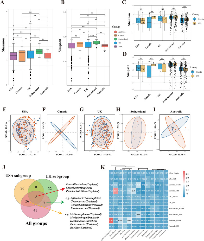
Fig. 3.
Subgroup analysis of the microbial distributions in different regions. A-B: Boxplots of the Shannon (A) and Simpson (B) index of samples belonging to five countries. C-D: Boxplots of the Shannon (C) and Simpson (D) index in groups of IBS and healthy controls in each country. E-I: PCoAs of Bray‒Curtis distances on the microbiota distributions in USA (E), Canada (F), UK (G), Switzerland (H), Australia (I). Each dot represents a patient with IBS or healthy controls. Points clustered in pink and blue eclipses represent the gut microbial composition of the IBS and controls, respectively. J: The Venn diagram illustrating the number of significantly enriched or depleted species between IBS and healthy controls in the whole cohorts, USA cohorts and UK cohorts. The IBS or control in parentheses means the group in which the species was enriched. The Wilcoxon Rank Sum Test was performed and *, **, *** stands for p-value < 0.01, 0.005 and 0.001, respectively). K: Heatmap visualization of the mean abundance in IBS patients and healthy controls based on regional differences. Each column represents one subgroup based on the IBS or control groups in different countries. Each row represents a genus. Values in each square represent the mean relative abundance in percentage (Log 10 transformed). The color scale was set based on the specific value of the mean relative abundance after the Log 10 transformation, with pink for relatively high abundance and blue for relatively low abundance

