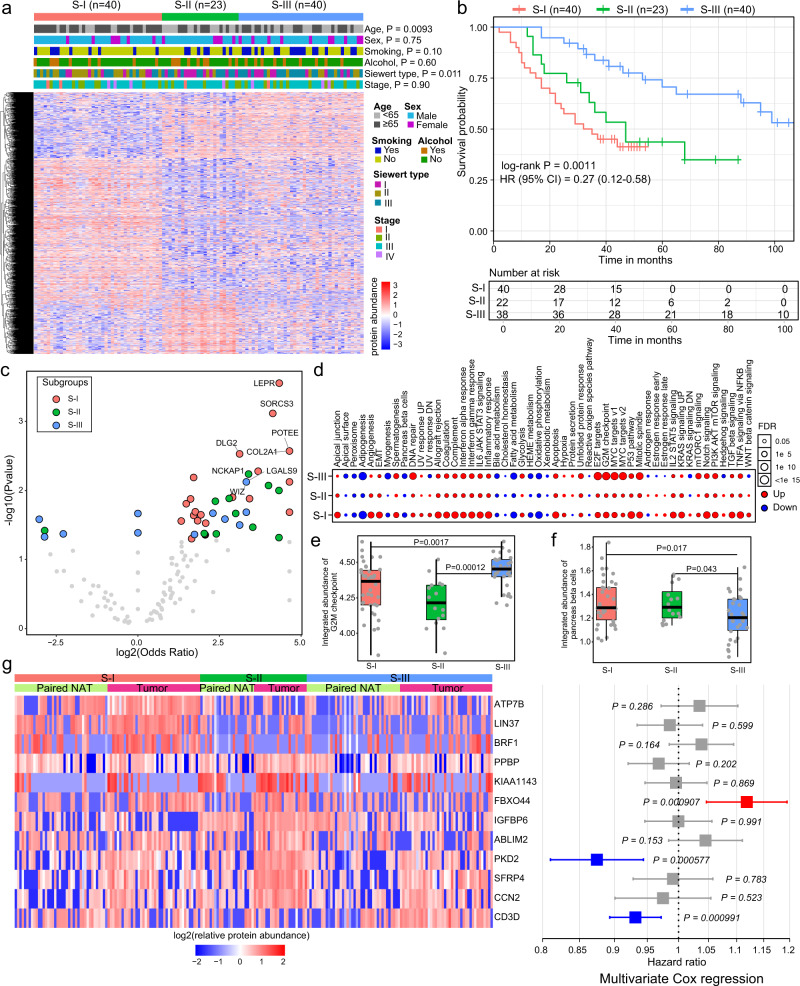
Fig. 3. Proteomic subtyping of AEG tumors.
a Heatmap showing the differentially expressed proteins among the three subtypes. Tiling bars above the heatmap show the distribution of different clinicopathological characteristics among the three subtypes. P, Fisher’s exact test. b Kaplan–Meier survival curve comparing patients in different subtypes (n = 40 for S-I, n = 23 for S-II, n = 40 for S-III). The hazards ratio (HR) with 95% confidence interval (CI) is also shown. c Volcano plot showing the difference in subtype-specific mutated genes. P, Fisher’s exact test. d The differences in integrated protein abundances of hallmarks comparing tumor and NAT samples in each subtype. e Comparison of the integrated abundance of “activity of G2M checkpoint” among three subtypes (n = 40 for S-I, n = 23 for S-II, n = 40 for S-III). P, two-sided Wilcoxon’s rank-sum test. f Comparison of the integrated abundance of “activity of MYC targets” gene set among the three subtypes (n = 40 for S-I, n = 23 for S-II, n = 40 for S-III). P, two-sided Wilcoxon’s rank-sum test. g Twelve signature proteins that are significantly associated with patient survival. The heatmap on the left shows the relative abundance of signature proteins in tumor and paired NAT samples of each subtype. The forest plot on the right shows the prognostic score for each protein in multivariate Cox regression analysis. The middle points indicate hazard ratios. The endpoints represent lower or upper 95% confidence intervals. Red indicates unfavorable proteins, while blue indicates favorable proteins. P, multivariate Cox proportional-hazards. In e and f, each box represents the IQR and median of integrated abundance in each subtype, whiskers indicate 1.5 times IQR.

