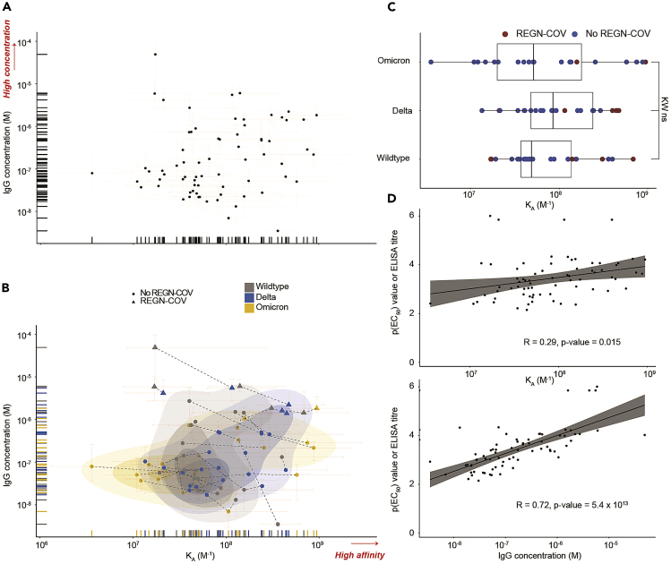
Figure 4.
Data visualization and exploration
(A) All quantifiable data points reflecting KA (in M−1) and IgG concentration values (in M) are plotted..
(B) Same as (A) but including a 2D scatter plot with integrated density contours. Triangles denote patients receiving the REGN-COV cocktail. RBD variants: wild type (WT, gray), delta (blue), omicron (yellow). Dotted lines represent the measurements of the same patient sample against different RBD variants. Plot taken from.1 Higher affinity and higher concentration (for A and B) are indicated in red writing with an arrow. 95% confidence intervals for each point are colored in light red.
(C) Boxplot analysis of KA values for WT, delta, and omicron RBD variants. Samples of patients treated with REGN-COV antibody cocktail are shown in red color.
(D) KA and IgG concentration were plotted against the respective ELISA titers, i.e., p(EC50) values, obtained for WT, delta, and omicron RBD variants. Concentration, but not affinity, is shown to correlate with titers measured by ELISA. Data and plots are from work recently published.1

