FIGURE.

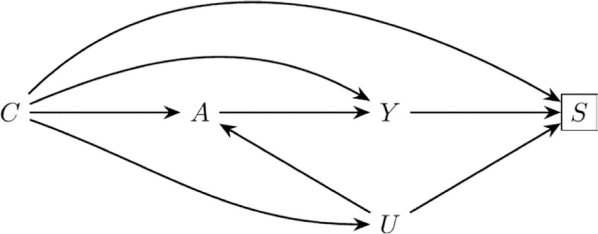
A directed acyclic graph describing a causal structure that could lead to selection bias. In the example in the text, A is coffee consumption, Y is pancreatic cancer, S is selection into the study, C is measured covariates, and U is gastrointestinal disorders.
