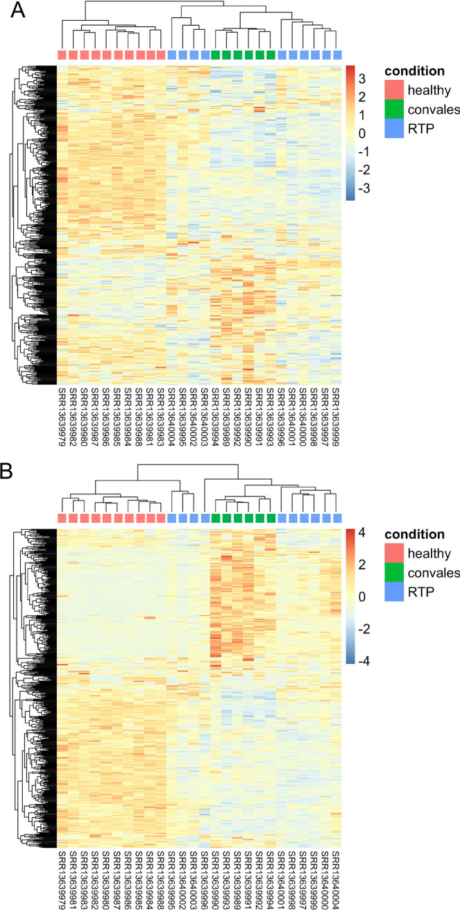
FIG 2.
(A and B) Heatmaps based on the top 500 HERVs as sorted by the highest mean (A) or variance (B) of expression. Hierarchical clustering of the top 500 HERV insertions with the highest average (A) or variance (B) of rlog-normalized counts. The top 500 HERV loci are in rows, and the samples are in columns. rlog-normalized counts are color-scaled from blue (minimum) to red (maximum). The correlation distance measure was used in clustering columns. Samples are annotated by condition: red, healthy controls; green, convalescent after recover from SARS-CoV-2 infection; blue, retesting positive after convalescence.

