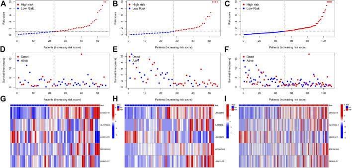
FIGURE 4.
(A–C) Classification of patients as high or low risk based on median risk score. (A) is from the testing cohort; (B) is from the training cohort and (C) is from the entire set. (D–F) Distribution plot of the risk score and survival status of the patients with HNSC. (D) is from the testing cohort; (E) is from the training cohort and (F) is from the entire set. (G–I) Heatmap of correlation between patients in different risk groups and expression of 5 prognostic CRLs. (G) is from the testing cohort; (H) is from the training cohort and (I) is from the entire set.

