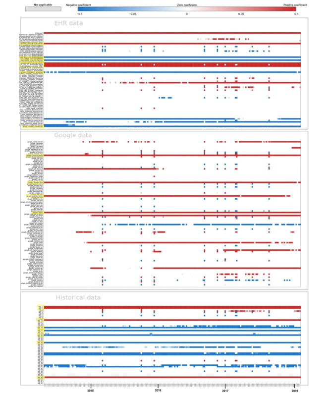
Figure 4.

Regional level. Heatmap of the coefficients. Each line of the heatmap corresponds to one predictive variable used in the model and each point of the line corresponds to 1 week predicted. The first block of variables corresponds to electronic health record (EHR) data, the second one corresponds to Google data, and the third one to historical data. In blue, a negative coefficient is associated with the variable, whereas in red, it is a positive coefficient. The white color means that the predictive variable is not selected by the model and does not participate in forecasting the corresponding week. In yellow, highlighted variables that are kept by the model almost all the time. For EHR data it corresponds to the predictive variables for the keywords “Par voie sous cutannée,” “Autre virus grippal identifié,” “Voies respiratoires. Virus non identifié,” “Pneumopathie,” “Bronchiolite aigüe,” “Virus respiratoire syncytial,” “Bronchite,” “Ventre.” For Google data, it is the keywords: “enero,” “gastro enterite,” “gastro entérite,” “fixations.” For historical data, it corresponds to the two previous weeks as well as week 10, week 15, week 17, week 20, week 25, and week 48 before the one we want to predict.
