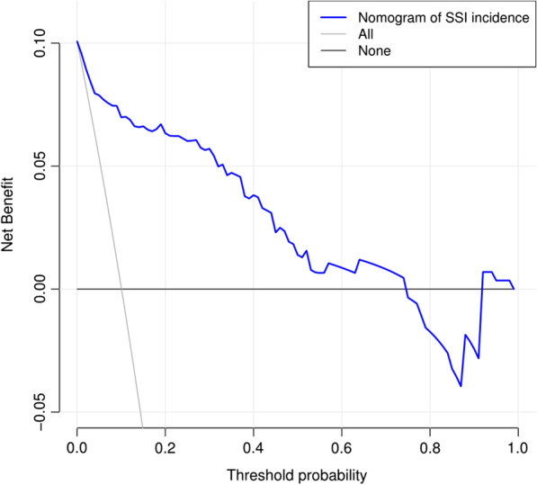
Fig. 7.

DCA of the nomogram model predicting SSI after TLIF. The solid blue line indicates the risk of SSI after TLIF predicted by the nomogram. The thin solid line indicates the assumption that SSI after TLIF is assumed to have occurred in all patients. The thick solid line indicates the hypothesis that no patients had SSI after TLIF. The decision curve demonstrated that using this nomogram in the current study to predict the risk of SSI after TLIF adds more benefit than either the intervention-all-patients scheme or the intervention-none scheme. This is the case if the threshold probability is less than 0.74. The x-axis shows the threshold probability. The y-axis represents the net benefit
