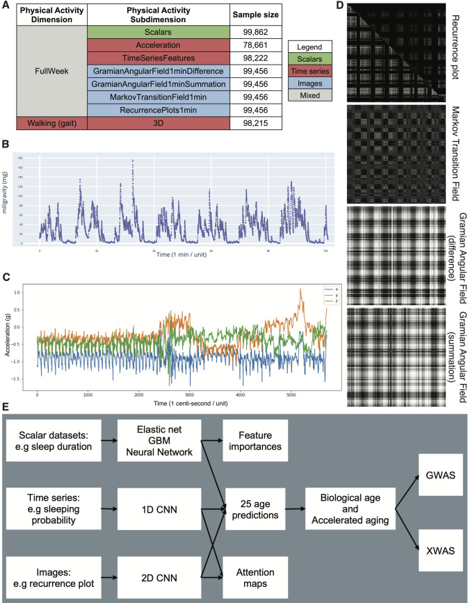
Fig 1.
Presentation of the datasets and overview of the analytic pipeline A - Preprocessed datasets obtained from the raw wrist accelerometer data, hierarchically ordered into physical activity dimensions and subdimensions. B - full week - Acceleration sample. Each time step corresponds to the mean acceleration over one minute. C - Gait sample, collected over one minute. D - Images generated from a raw accelerometer record. E - Overview of analytic pipeline. D—See methods for a description of the images. For example, the recurrence plot measures the similarity between the physical activity captured at different times of the week. The axes each correspond to the full week. The upper right triangle corresponds to similarities in sleep activities, and the lower left triangle corresponds to similarities in the remaining time.

