. 2022 Dec 28;11:e80380. doi: 10.7554/eLife.80380

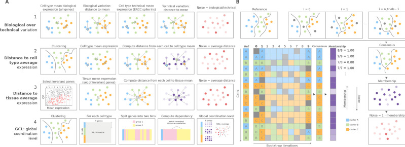
Figure 1. Overview of computational methods for the quantification of transcriptional noise and example workflow in Scallop.

(A) The methods implemented in Decibel Python toolkit are summarized through diagrams depicting how they measure transcriptional noise. (1) Biological variation (whole transcriptome-based Pearson’s correlation distance between each cell and the mean expression vector), divided by the technical variation (External RNA Controls Consortium [ERCC] spike-in based distance; Enge et al., 2017). (2) Mean whole transcriptome-based Euclidean distance to cell type average (Enge et al., 2017). (3) Mean invariant gene-based Euclidean distance to tissue average (Enge et al., 2017). (4) GCL (Levy et al., 2020) per cell type. Stars represent the ‘center’ of each cluster (average gene expression for each cell type). (B) Scallop: example workflow on a 16 cell dataset. A reference clustering solution (Ref) is obtained by running a community detection algorithm (default: Leiden) on the whole dataset. Three clusters are obtained: A (blue), B (green), and C (orange). Then, a subset of cells is randomly selected and subjected to unsupervised clustering n_trials = 10 times (cells not selected in each bootstrap iteration are shown in gray). The cluster labels across bootstrap iterations are harmonized by mapping the cluster labels with the greatest overlap, using the Hungarian method (Munkres, 1957). A consensus clustering solution is derived by selecting the most frequently assigned cluster label per cell, and the membership score is computed as the frequency with which the consensus label was assigned to each cell. Scallop measures noise as a 1 ‍ − membership value assigned to each cell.

Figure 1.

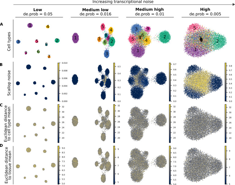
Figure 1—figure supplement 1. Performance of Scallop and two distance-to-centroid methods on four artificial datasets with increasing transcriptional noise.

Figure 1—figure supplement 1.

(A) Uniform manifold approximation and projections showing the cell type labels (1–9) for the four artificial datasets with different degrees of noise. All four datasets consist of 10 K cells and have the same cellular composition. Datasets are shown from least to most noisy: low, medium low, medium high, and high noise. De.prob represents the probability that a gene is differentially expressed between cell types in the dataset. (B–D) The output of three methods for the quantification of transcriptional noise: Scallop (B), whole transcriptome-based euclidean distance to cell type mean (C), and invariant gene-based euclidean distance to tissue mean (D).
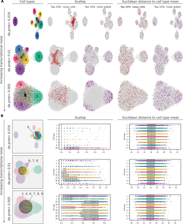
Figure 1—figure supplement 2. Ability of Scallop and a distance-to-centroid method to detect noisy cells within cell type clusters.

Figure 1—figure supplement 2.

(A) Uniform manifold approximation and projections (UMAPs) showing the cell type labels (1–9) and the top 10% noisiest and 10% most stable cells according to Scallop and a distance-based method (whole-transcriptome Euclidean distance to the cell type mean) for three artificial datasets with increasing transcriptional noise (medium low, medium high, and high from Figure 1—figure supplement 1). (B) UMAPs showing cell type labels for the three artificial datasets. Area on the UMAP that contains the noisiest cells is highlighted, and the cell type labels that are most represented in it are shown. Stripplots over boxplots showing the distribution of transcriptional noise per cell type, as measured by Scallop and the whole-transcriptome Euclidean distance to cell type mean.
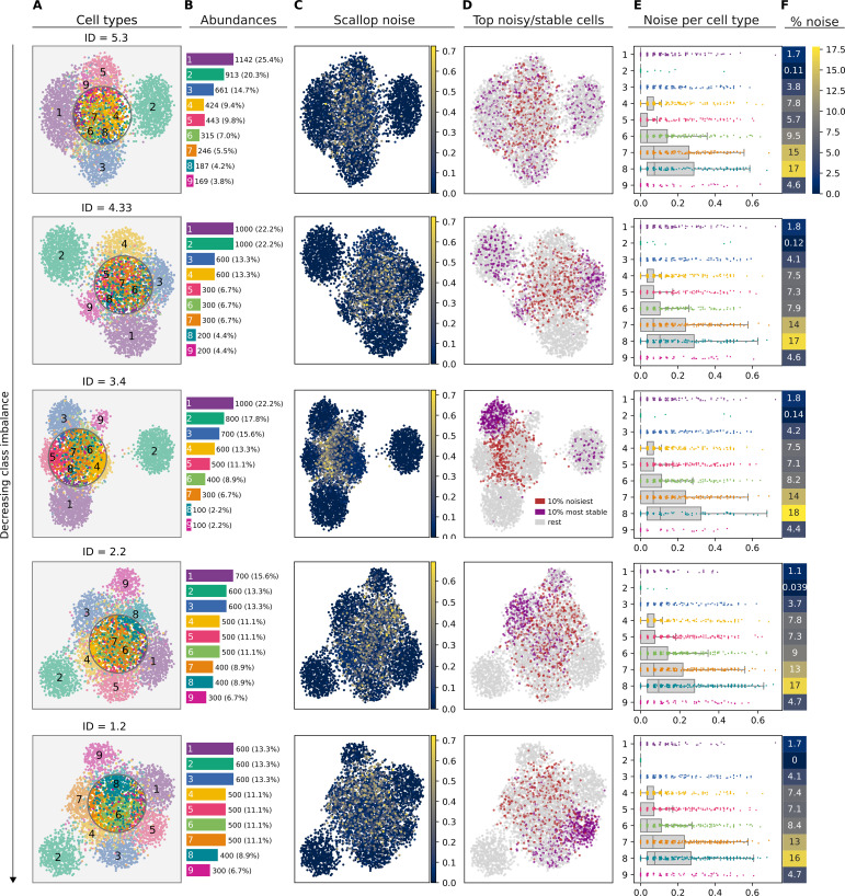
Figure 1—figure supplement 3. Effect of cellular composition on the performance of Scallop.

Figure 1—figure supplement 3.

(A) Uniform manifold approximation and projections (UMAPs) showing the cell type labels for five equally sized datasets (4500 cells) with the same cell type populations (1–9) in different relative abundances. Datasets are shown from most to least imbalanced, according to their imbalance degree (ID). Cell type labels shown on the UMAP plots are equivalent across cell types. (B) Absolute and relative (%) abundance of each cell type. (C) Transcriptional noise as measured by Scallop: 1 - membership to clusters. (D) Top noisy/stable cells: 10% noisiest and 10% most stable cells according to Scallop. (E) Stripplots over boxplots showing the distribution of transcriptional noise values per cell type. (F) Percentage of noise (averaged over all the cells constituting each cluster).
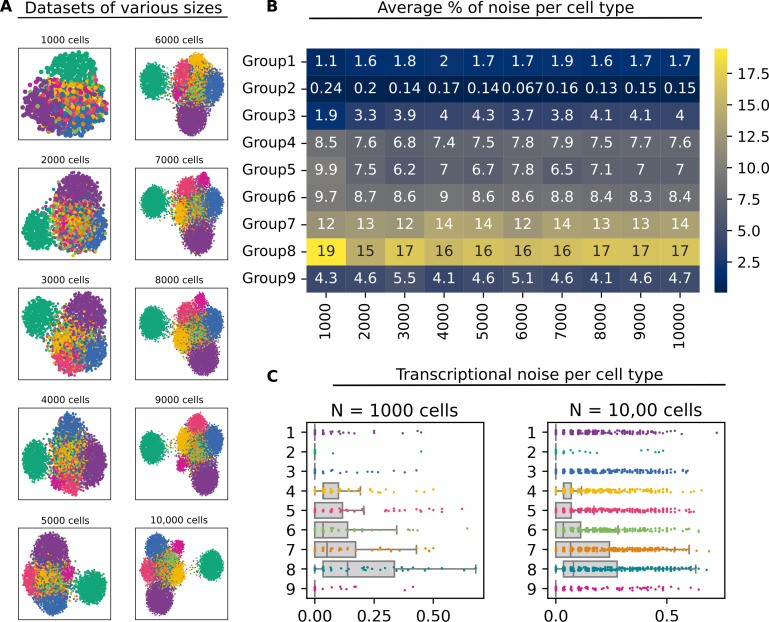
Figure 1—figure supplement 4. Effect of dataset size on the performance of Scallop.

Figure 1—figure supplement 4.

(A) Artificial datasets with different sizes (number of cells). All datasets were obtained by subsampling cells from the same dataset and contain the same nine cell types. (B) Average percentage of noise per cell type in each of the datasets. (C) Stripplots showing the distribution of transcriptional noise values in the two extreme datasets (N=1000 and N=10,000 cells).
Figure 1—figure supplement 5. Effect of the number of genes on the performance of Scallop.
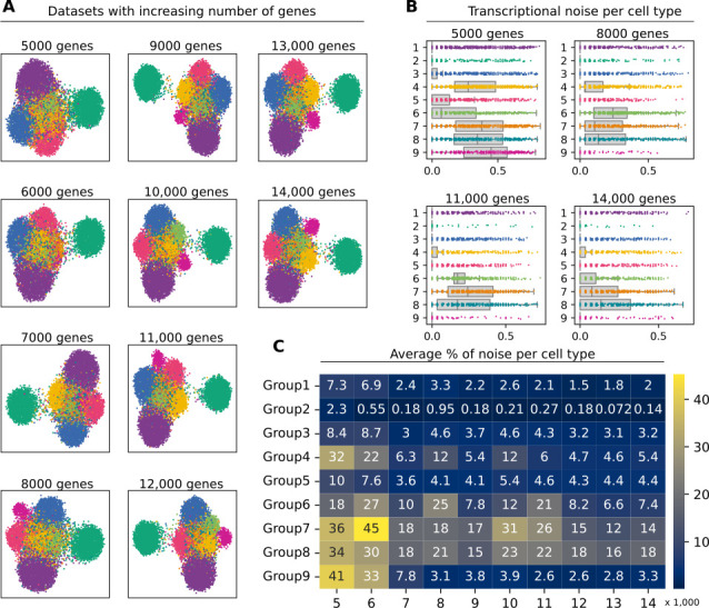
Figure 1—figure supplement 5.

(A) Uniform manifold approximation and projection plots of artificial datasets where the expression of top 10 markers for the cell type Group2 has been set to zero. We test the effect of removing the gene markers that define the cell type Group2. (B) Stripplots showing the distribution of transcriptional noise per cell type in four datasets containing 5 K, 8 K, 11 K, and 14 K genes. (C) Average percentage of noise per cell type in each dataset.
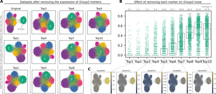
Figure 1—figure supplement 6. Effect of marker expression on the performance of Scallop.
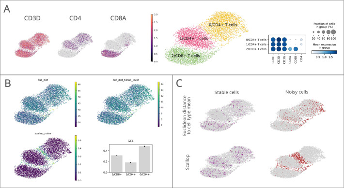
Figure 1—figure supplement 6.

(A) Uniform manifold approximation and projections (UMAPs) showing the cell type labels (1–9) for the 10 K medium high noise artificial dataset and 10 versions of the same dataset where the top 10 markers of cell type Group2 have been removed. Top1 represents a dataset that has had the expression of the first gene marker for Group2 set to zero, Top2 has had the first 2 gene markers set to zero, and so on. The cell type under study (Group2) is labeled with a ‘2’ on each UMAP. (B) Transcriptional noise values for Group2 cells as we remove its main markers from the dataset. The average percentage of transcriptional noise is shown on top of the stripplots. (C) UMAPs showing the expression of five gene markers from the top 10 list.
Figure 1—figure supplement 7. Performance of Scallop in comparison to pre-existing methods for the quantification of transcriptional noise.

Figure 1—figure supplement 7.

The different methods were tested on a dataset of 8278 human T lymphocytes. (A) Uniform manifold approximation and projections (UMAPs) and dotplot showing CD3, CD4, and CD8 marker gene expression per cluster. (B) Representation of transcriptional noise levels, as measured by using two distance-to-centroid methods (euc_dist and euc_dist_tissue_invar), 1 - membership (scallop_noise) and global coordination level (GCL). (C) The 10% most stable (purple) and 10% most unstable (red) cells are represented on the UMAP plots for Euclidean distance to cell type mean (top row) and Scallop methods (bottom row), respectively.
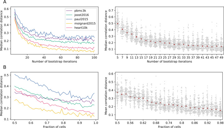
Figure 1—figure supplement 8. Scallop robustness in relation to input parameters.

Figure 1—figure supplement 8.

The plots on the left show the median correlation distance between membership scores of different runs of Scallop against (A) the number of trials, (B) the fraction of cells used in each bootstrap, and (C) the resolution given to the clustering method (Leiden) in five independent scRNAseq datasets (PBMC3K, Joost et al., 2016; Paul et al., 2015; Moignard et al., 2015, Heart10K). The median correlation distance was computed over 100 runs of Scallop. The swarmplots on the right show the distribution of the correlation distances between membership scores against each of the input parameters for the heart10k dataset. The median is shown as a red point. While, for the sake of clarity, a random sample of 100 correlation distances is shown for each value of the parameter under study, the median was computed using all the correlation distances. Scallop membership scores converge as we increase the number of bootstrap iterations and the fraction of cells used in the clustering.
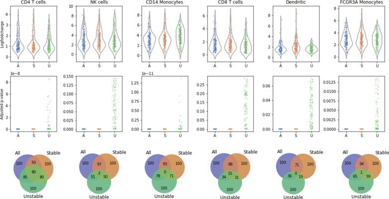
Figure 1—figure supplement 9. Stable cells as identified with Scallop are more representative of the cell type than unstable cells.

Figure 1—figure supplement 9.

Distribution of log-fold changes (top row) and adjusted p-values (middle row) of the first 100 differentially expressed genes (DEGs) between each cell type or subtype and the rest of the cells in six cell types and subtypes from the 10× PBMC3K dataset. The overlap between the DEGs found when using all of the cells, only the stable cells, and only the unstable cells is also shown (bottom row). The adjusted p-values obtained with all the cells are equivalent to those obtained using only the most stable half of the cells. In contrast, the differential expression of many genes is not statistically significant when using the unstable half from each population. The overlap between the top 100 DEGs obtained is very high between the stable cells and all cell subsets, whereas DEGs obtained in unstable cells have a very low intersection with all cells.