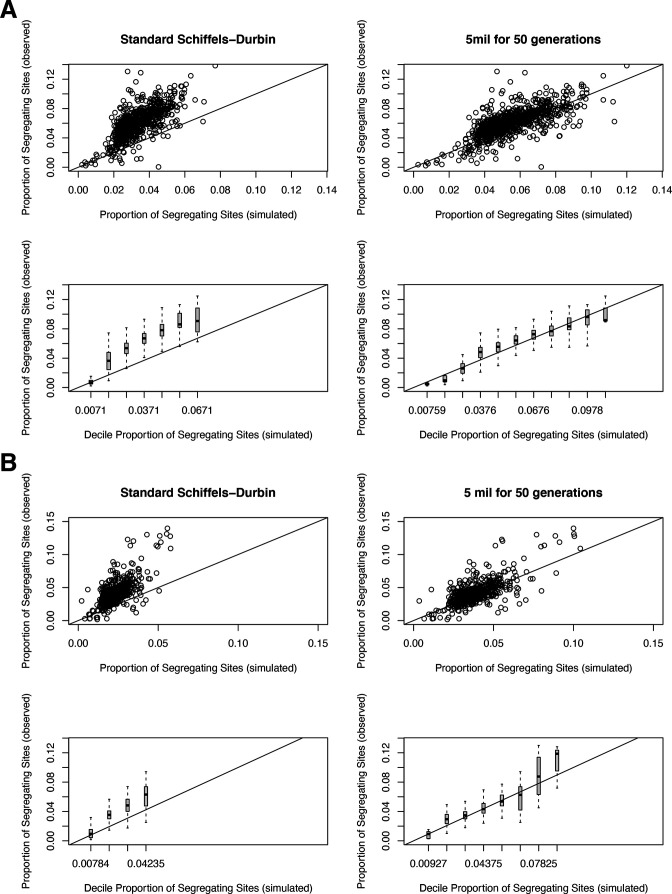
Appendix 1—figure 2. The proportion of segregating synonymous sites in genes for observed and simulated data.
(A) For autosomal genes, the proportion of segregating synonymous sites in the gnomAD Non-Finnish European (NFE) sample on the y-axis compared to the proportion of segregating synonymous sites simulated under a neutral (hs = 0) model and per-gene synonymous mutation rates on the x-axis. Each point in the top row represents each gene, while the bottom row shows boxplots summarizing genes in increments of 0.01 segregating sites in simulations. On the left, genes are simulated under the widely used Schiffels–Durbin demographic model for population growth in Europe (Schiffels and Durbin, 2014). On the right, genes are simulated under a slightly modified version of this model, in which we set the effective population size Ne equal to 5 million for the past 50 generations. (B) The same plots, but for genes on the X chromosome.

