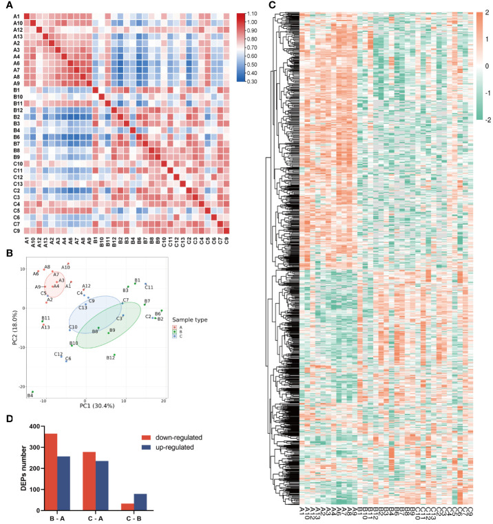
Figure 2.
Characterization of proteomic of human bone tissue at different ages. (A) Pearson’s correlation matrix of 33 samples. The color of the square represents the magnitude of the correlation: blue represents a small correlation coefficient, while red represents a large correlation coefficient as the color bar shows. (B) PCA plot of the three groups. Group A was distinct from groups B and C. (C) Heatmap of all protein expression in the three groups. (D) The numbers of differentially expressed proteins (DEPs) in the three pairwise-compared groups. The red bar indicates the downregulated proteins, and the blue bar indicates the upregulated proteins. In the chart, group A refers to the children, group B refers to the middle-aged individuals, and group C refers to the older individuals.

