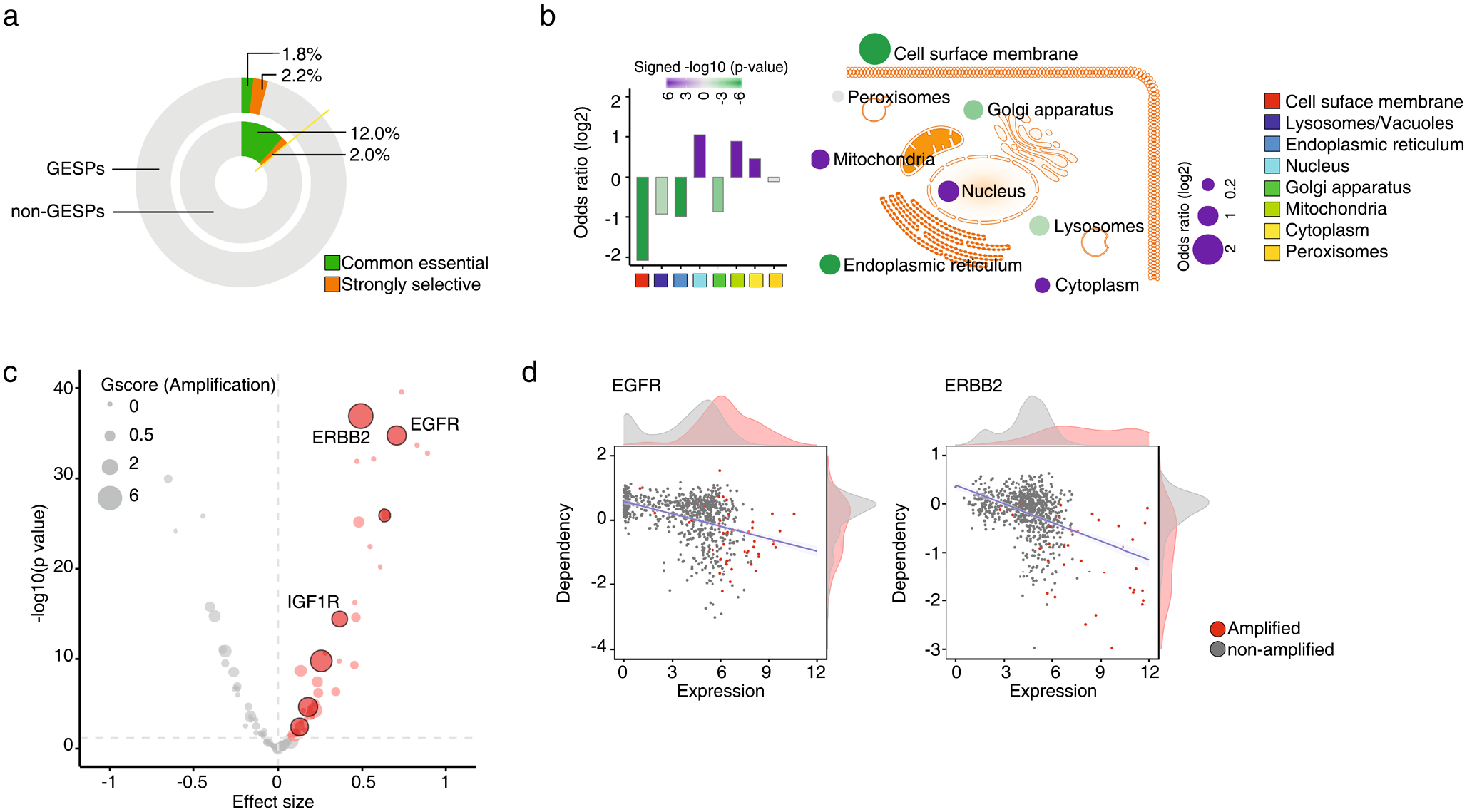
Extended Data Fig. 8 |. Characterization of dependencies of the GESPs in cancer cell growth.

a, Proportional doughnut graph showing the frequency of common essential and strongly selective genes among GESPs (outer layer) and non-GESPs (inner layer). b, Summary of enrichment for essential genes (common essential and strongly selective) in the corresponding subgroups based on subcellular locations. Bar plot (left) and bubble plot (right) show the odds ratios on a log scale for each subgroup. Purple and green bars indicate that essential genes are enriched and depleted in the corresponding subgroups, respectively. The color intensity of the bars and bubbles indicates the enrichment significance calculated by two-sided Fisher’s exact test. c, Summary of association between mRNA expression levels and dependencies for essential GESPs. The x-axis represents the effect size of each gene. Positive effect size values represent higher dependency in cells expressing higher level of mRNA. The y-axis represents the negative logarithm (base 10) of the p-values from the Bioconductor Limma package. Benjamini-Hochberg (BH) method was used to adjust the p-values. Each circle corresponds to a GESP with size proportional to overall G-score (gain). Red circles represent GESPs whose dependencies are significantly and positively correlated with their mRNA expression levels. GESPs which are recurrently amplified in tumors and whose dependencies are significantly and positively correlated with both copy number and mRNA expression levels are outlined with black border. d, Association between mRNA expression levels and dependencies for EGFR (left) and ERBB2 (right). Red dots represent cells with gene copy number amplification. Density plots of gene expression and gene dependencies are stratified by gene amplification status.
