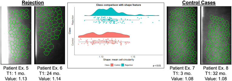
Figure 6.
Comparison of a cell-cluster graph feature between rejection (left) and control (right) patients. The two rejection images on the left were taken from the same patient's eye 16 months and 24 months post-DMEK. The two images on the right were taken from the same patient's eye 13 and 24 months post-DMEK. The images are overlaid with cell-cluster graphs. The violin and box plots compare the distribution of number of connected components in a cell-cluster graph calculated from control and rejection eye images.

