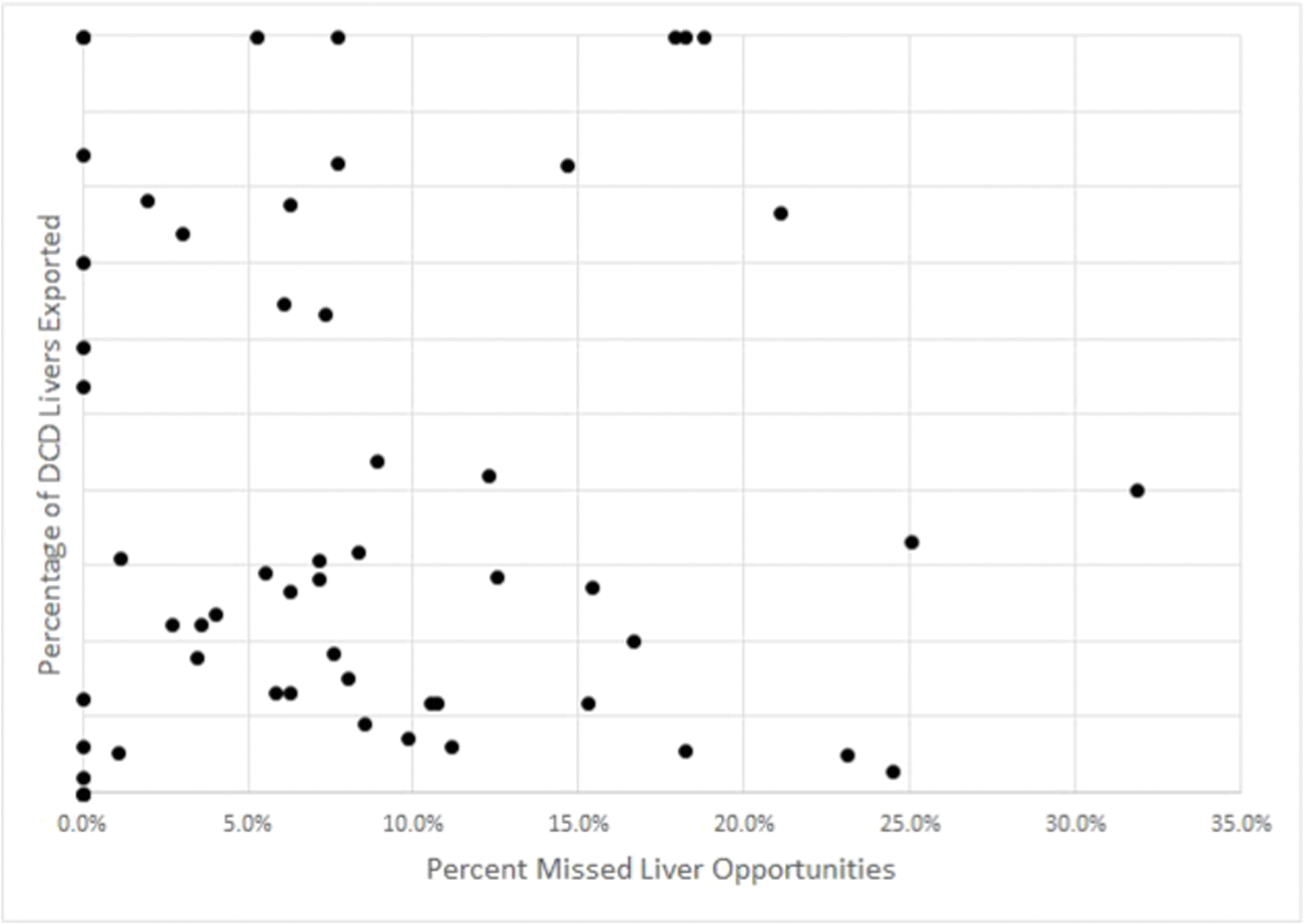
Fig. 5.

Plot of percentage of missed opportunities after cardiac death liver recovery (x-axis) by DSA versus percentage of donation after cardiac death livers exported by DSA (y-axis)
Online Map: https://arcg.is/nHKe4. Interactive map depicting the locations of hospitals performing DCD liver transplants during the study period (red dots), hospitals with recovered DCD livers (blue dots), and hospitals with non-recovered potential DCD livers (green dots). Click the icon to select layers representing each of the three hospital types above.
