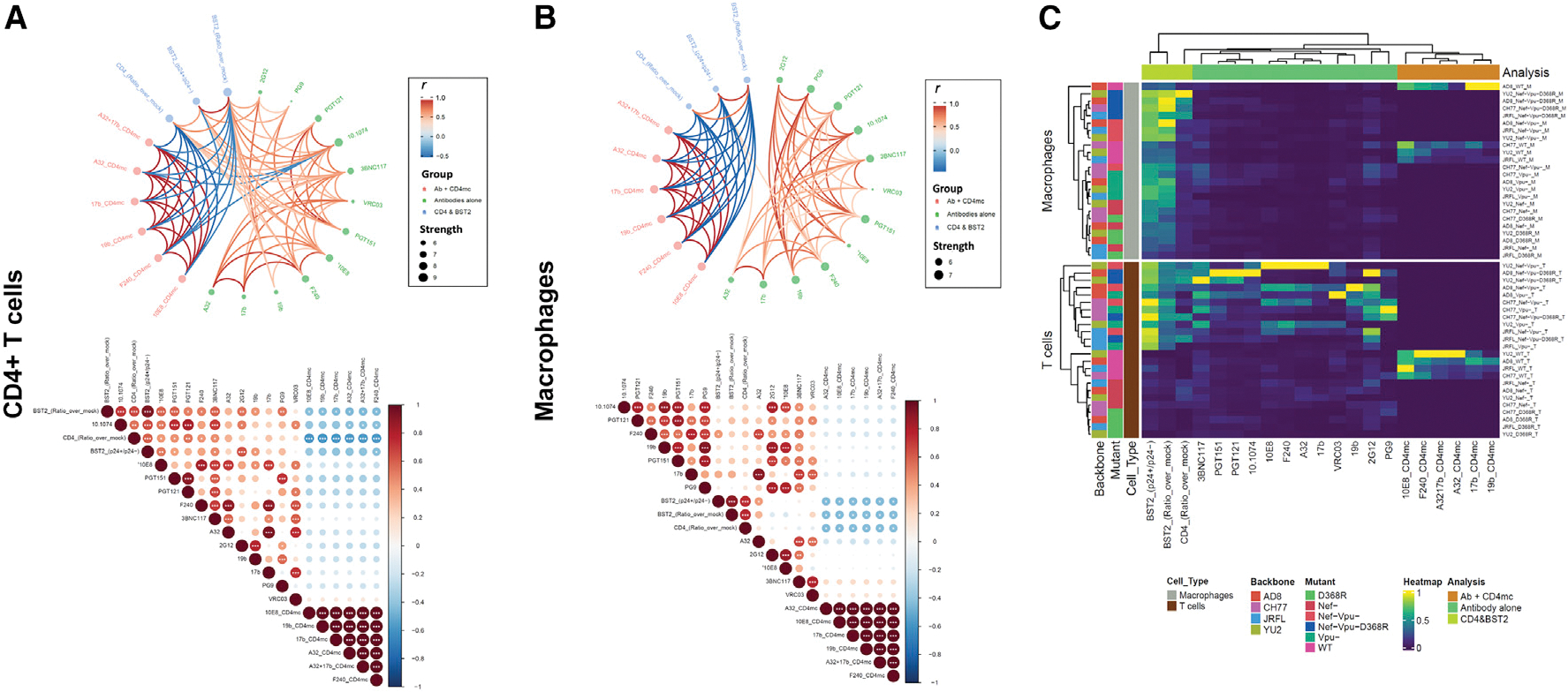
Figure 5. Network associations of Env epitope recognition with BST2 and CD4 on CD4+ T cells and macrophages.

(A and B) Circular edge bundling plots (top) and correlation matrices (bottom) for CD4+ T cells (A) and macrophages (B) where red and blue edges (top) and circles (bottom) represent positive and negative pairwise correlations between connected variables, respectively. Nodes in the edge bundling plots (top) are color-coded based on the grouping of variables shown in the legend with node size corresponding to degree of relatedness of correlations. Only significant correlations (p < 0.05, Spearman rank test) are displayed in the edge bundling plots (top). In the correlograms (bottom), *p < 0.05, **p < 0.01, ***p < 0.005.
(C) Heatmap showing Env, BST, and CD4 expression relative to virus strains tested and cell type. Columns represent recognition of BST2, CD4, and Env clustered based on similarity and grouped by analysis method according to the color code provided. Rows represent the viruses/mutants grouped according to cell type. Virus IDs are clustered according to their binding profile and done separately for each cell type.
