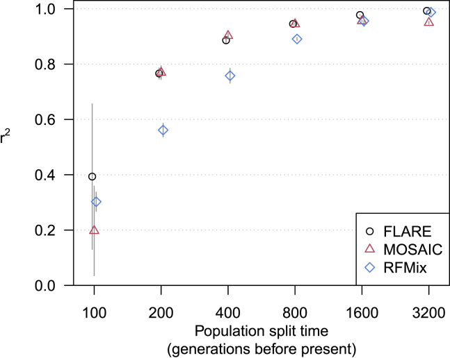
Figure 4.
Accuracy for simulated sequence data with two-way admixture
The y axis shows squared correlation between true and inferred local ancestry dose averaged over ancestries and across four replicate simulations (details in subjects and methods). Error bars (±2 standard errors) are shown as gray lines. The x axis shows the split time for the two ancestral populations. Each of the three ancestries is represented by a reference panel of size 200, and each analysis includes 100 admixed individuals.

