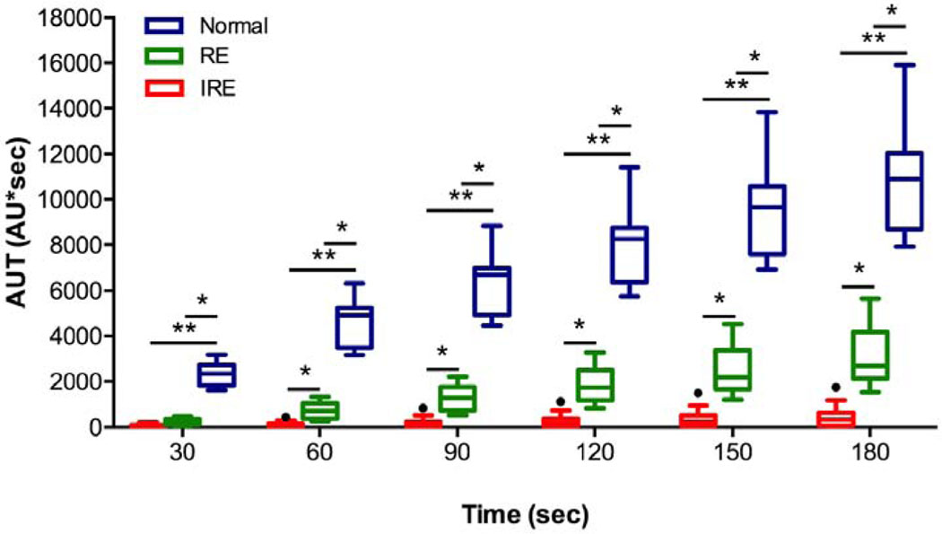
Figure 2:
The Tukey boxplot shows the areas under the time-intensity curves (AUT) over 30, 60, 90, 120, 150 and 180 seconds after the initiation of enhancement for the IRE (red, n = 13), RE zones (green, n = 13) and the normal liver parenchyma (blue, n = 13). AUT60, AUT90, AUT120, AUT150, and AUT180 had the ability to differentiate RE from IRE zones. The box plot displays the full range of variation (from min to max), and the dots indicate discrete values. Statistically significant differences are marked by stars (* P < 0.05, ** P < 0.0001).

