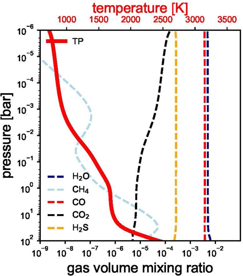
Extended Data Fig. 2. Atmospheric structure arising from the best-fit model.

The thick red curve (and corresponding top x axis) shows the resulting 1D radiative–convective equilibrium temperature profile. The dashed lines (and bottom x axis) show the vertical gas mixing ratio profiles under the assumption of thermochemical equilibrium. These abundances, along with the absorption cross-sections shown in the bottom panel of Fig. 3, are what control the relative contributions of each gaseous opacity to the total transmission spectrum.
