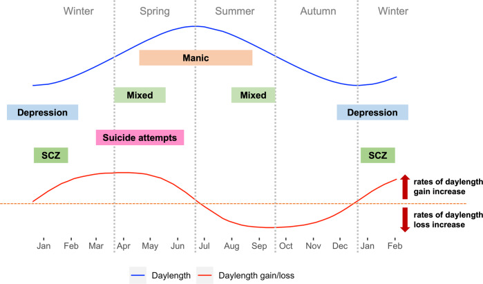
Fig. 1. Peaks of psychiatric symptoms in relationships to daylength and day-to-day daylength gain/loss.
Blue curve: daylength changes throughout the year in the northern hemisphere. Red curve: day-to-day daylength gain/loss throughout the year in the northern hemisphere. Red dashed line: threshold indicating there is no change in daylength compared to the previous day. Curve above the dashed red line indicates days that have longer daylength than the previous day, while curve below the dashed red line indicates days that have shorter daylength than the previous day. The peak around late March is the day with greatest daylength gain, the nadir around late September is the day with greatest daylength loss. Mixed: mixed symptoms in bipolar disorders; SCZ: Schizophrenia hospitalizations & first-episode onset.

