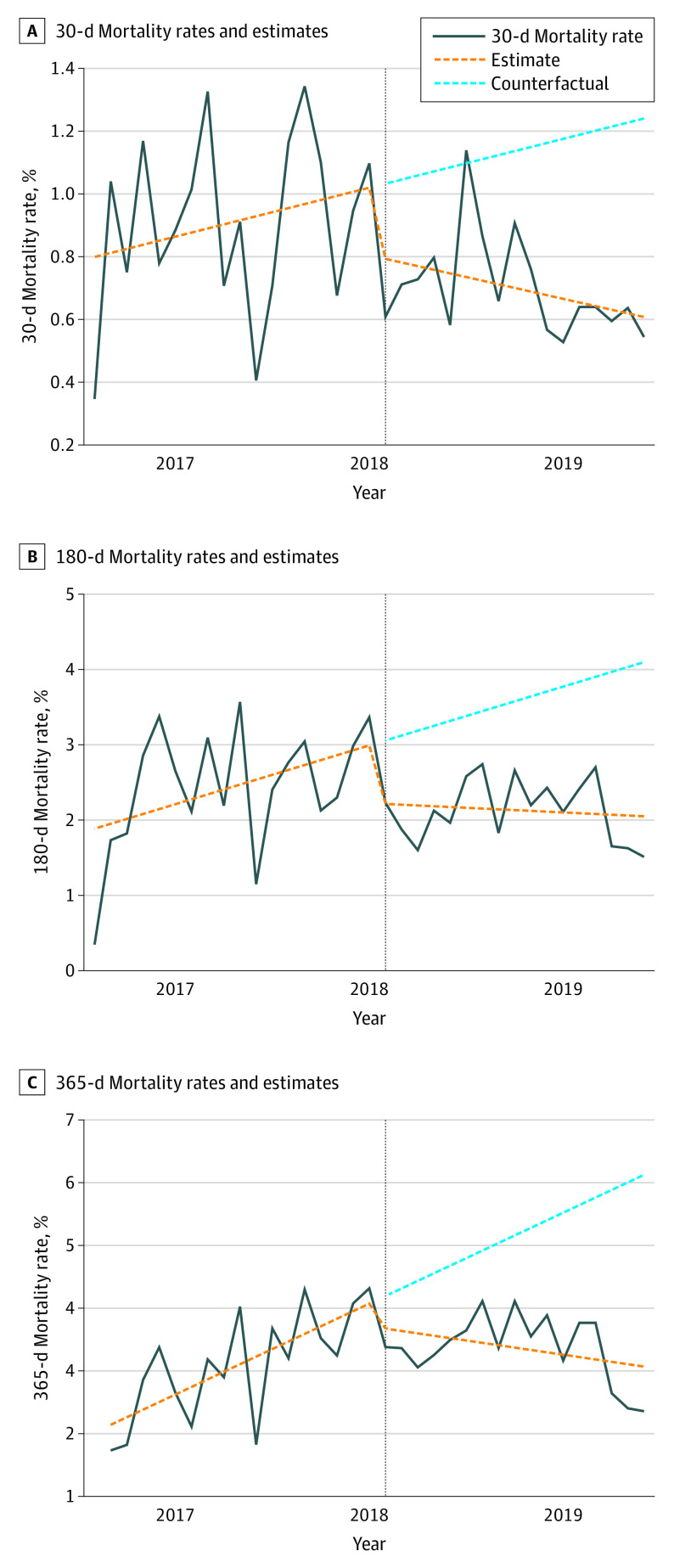
Figure. Interrupted Time Series Analysis.
Plots demonstrate 30-, 180-, and 365-day mortality rates before and after Best Practice Alert (BPA) implementation. Rates are expressed as deaths per 100 procedures. Implementation is noted by the vertical line (February 2018). The solid lines are actual mortality rates, and the dotted orange trend lines represent estimates based on generalized linear model regression. The dotted blue trend lines represent a counterfactual situation where the preintervention trend would continue into the postintervention period. Comparison between the postintervention trend line and the counterfactual trend line represents the association of BPA implementation with mortality.

