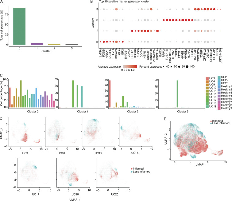
Figure S2.
Transcriptional clusters of colon PCs. (A) Bar diagram displaying the fraction of all cells (in %) represented in each of the four transcriptional clusters. (B) Dot plot showing the relative expression of the top marker genes of each cluster (x axis) across all clusters (y axis). Each dot encodes both the detection rate and average gene expression in detected cells for a gene in a cluster. Darker color indicates higher average gene expression from the cells in which the gene was detected, and larger dot diameter indicates that the gene was detected in a greater proportion of cells from the cluster. (C) Bar diagram showing the representation of each of the four transcriptional clusters among all study subjects (x axis) as indicated. Each plot represents the indicated cluster and the fractions add up to 100% in each plot. (D) UMAP plots showing the cell embeddings colored by the inflammation status of the tissue the cells were isolated from for all subjects that had both inflamed and less-inflamed tissue. (E) UMAP plot showing all the cell embeddings shown in D but merged into one plot.

