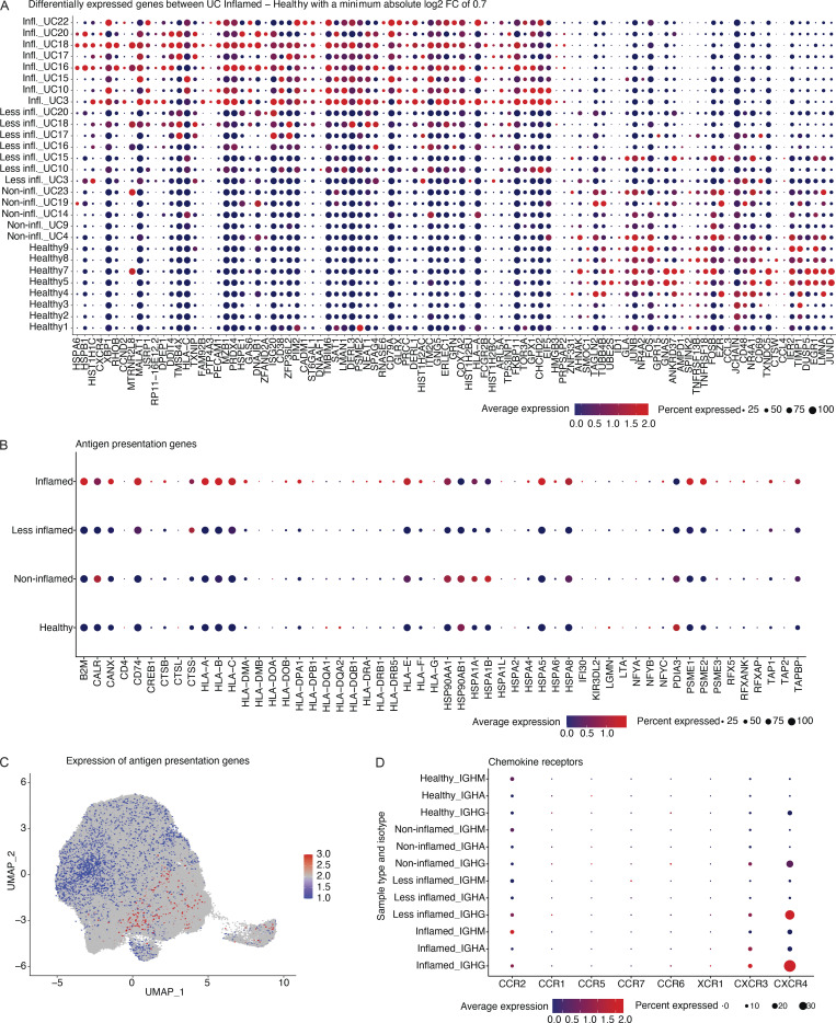
Figure S3.
Genes that are higher expressed among PCs from inflamed tissue. (A) Dot plot showing the relative expression of the significantly differentially expressed genes when comparing PCs derived from inflamed tissue with PCs from HCs (x axis) across all subjects and disease states (y axis; pseudobulk DE analysis, FDR < 0.05). Each dot encodes both the detection rate and average gene expression in detected cells for a gene in a cluster. As indicated, dark red color indicates higher average gene expression from the cells in which the gene was detected, and larger dot diameter indicates that the gene was detected in a greater proportion of cells from the cluster. (B) Dot plot showing the relative expression of the antigen presentation genes (x axis) in PCs derived from tissue in different disease states as indicated (y axis). Color and size coding as in A. (C) UMAP plot showing the cell embeddings based on the transcriptome. Cells are colored based on their antigen presentation genes’ expression scores (Materials and methods), where PCs highlighted in dark red show the highest levels of expression. (D) Dot plot showing the relative expression of chemokine receptor genes (x axis) in PCs derived from tissue in different isotypes and disease states as indicated (y axis). Color and size coding as in A and B.

