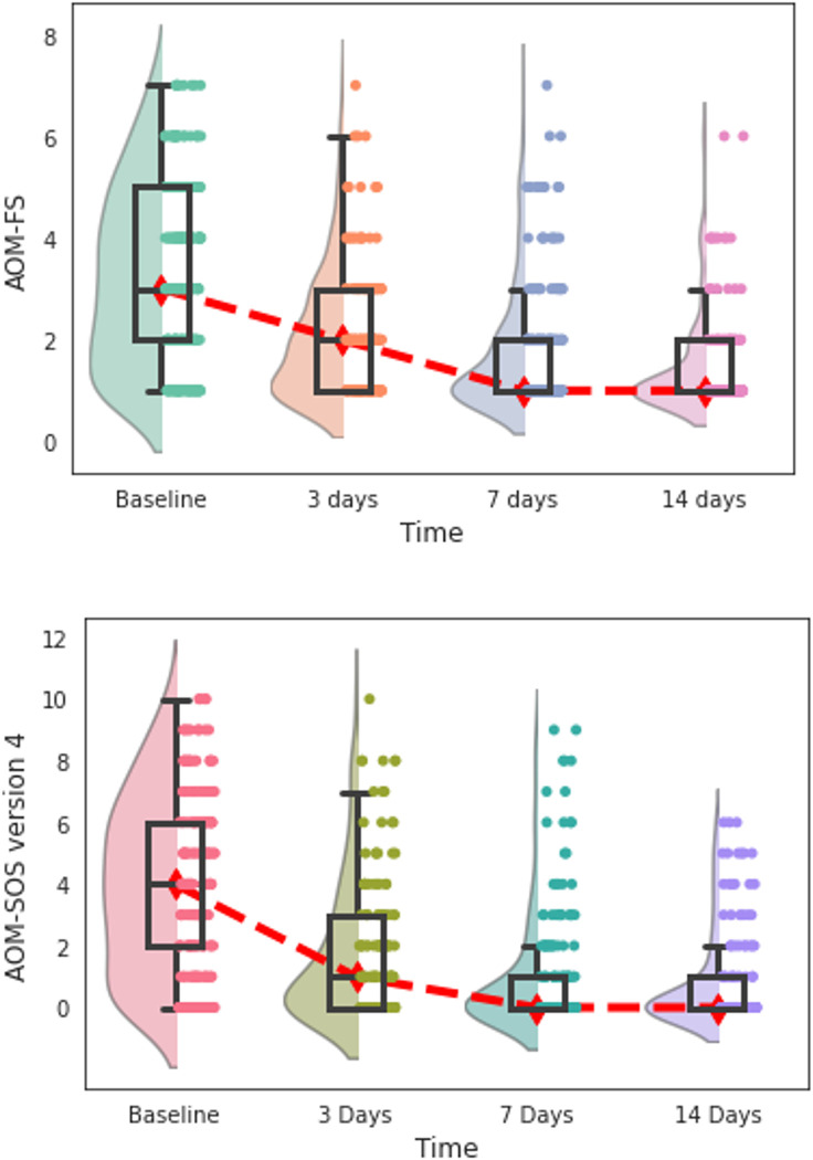
Fig 3. Distribution of the AOM-FS and AOM-SOS (version 4) symptom scores by days since enrolment into trial.
The distribution of scores within each time point is plotted using a combination of a violin (represented by a shaded plot), a boxplot (represented by a box), and data points (represented by dots). The width of a violin plot represents the number of results within that score. The boxes indicate the 25th (lower horizontal line), median (middle horizontal line), and 75th (upper horizontal lines) percentiles of the distribution. Dot plots are jittered to increase visibility. The red line indicates the trend in median values over time. Lower values indicate lesser symptom severity. Day 7 and 14 boxplot lines for 25th percentile and median overlap due to more children having lower scores.

