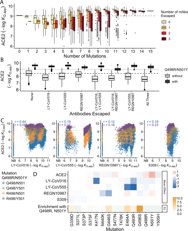
Figure 4. Trade-offs and comparison with ACE2 affinity.
(A) Distribution of ACE2 binding affinity grouped by number of BA.1 mutations and the number of monoclonal antibodies escaped. The dashed line corresponds to the affinity of the Wuhan strain. (B) ACE2 affinity distribution grouped by antibodies escaped and the presence of compensatory mutations (N501Y and Q498R). The dotted line represents the affinity of the Wuhan strain, while the dashed line shows the average affinity of the genotypes without compensatory mutations that bind all antibodies. (C) Affinities to monoclonal antibodies plotted as a function of the ACE2 affinity for all genotypes. Points are colored by presence of Q498R and N501Y. (D) Mean effect (averaged over all backgrounds at the other loci) of each mutation on antibody affinity and on ACE2 affinity (red-blue colormap) compared to the enrichment of their frequency with Q498R and N501Y (orange colormap). The enrichment score is defined as the normalized frequency a mutation emerged on a branch on which mutations Q498R and N501Y appear divided by the normalized frequency it emerged on any intermediate background between Wuhan and BA.1.

