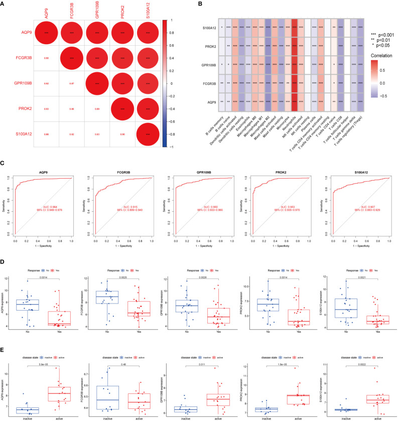
Figure 5.
Identification of DEGs between subtypes (A) The correlation of five DEGs. Red represented positive correlation. (B) Pearson correlation analysis revealed that immune cells had strong positive and negative correlations with DEGs. Red represented positive correlation, purple represented negative correlation. (C) The area under the ROC curve indicates the effectiveness of the five DEGs in the diagnosis of UC. (D) Boxplot indicated that 5 DEGs could predict the effect of anti-TNF-α treatment in GSE92415 dataset. (E) Boxplot showed that in the GSE53306 cohort the expression of five DEGs could distinguish between active UC and remission UC, except for FCGR3B. The upper and lower ends of the boxes represented the interquartile range of values. The lines in the boxes represented the median value. The asterisks represented the statistical p-value (*P < 0.05; **P < 0.01; ***P < 0.001).

