Fig. 2.
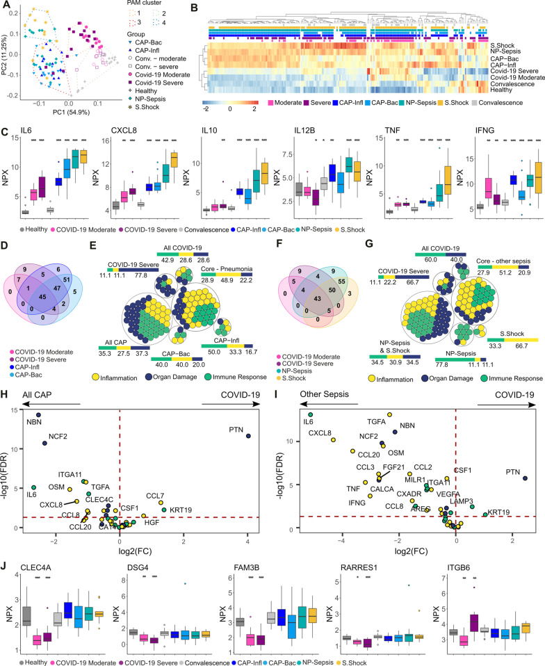
Disease-specific plasma protein signatures in COVID-19 and sepsis. A Principal component (PC) analysis based on the levels of all proteins. The PAM clusters are shown by the dashed lines and encompass the samples closest to the cluster’s medoid. B Heatmap of mean expression (z scores) of all proteins (x axis) per group with hierarchical clustering (distance: Spearman’s ρ). The color-coded boxes denote statistically significant differences in comparison to healthy controls. C Plasma levels of classical sepsis-associated cytokines. D Venn diagram showing the number of proteins altered in the indicated patient groups compared to healthy controls. E Proteins from D color-coded based on their PEA panel. The adjacent bars represent the percentage of each PEA panel. Intersections (∩) between groups are denoted as: CAP-Infl ∩ CAP-Bac, “ALL CAP”; severe COVID-19 ∩ moderate COVID-19, “All COVID-19”; all COVID-19 ∩ all CAP, “Core—Pneumonia”; F Venn diagram showing the number of proteins altered in the indicated patient groups compared to healthy controls. G Proteins from F color-coded based on their PEA panel. The adjacent bar represents the percentage of each PEA panel. The “Core—other sepsis” group includes proteins with significantly different levels in the two COVID-19 groups, NP-sepsis, and septic shock; H, I Volcano plot depicting the difference in plasma levels of the Core-Pneumonia (H) and Core-other sepsis sets (I); color-coded based on the PEA panel. The horizontal dashed line indicates adjusted p values = 0.05; J Plasma proteins unique to COVID-19. Boxplots are labeled with gene names and stars represent significance in comparison to healthy controls: *Adj. p-value < 0.05, **Adj. p-value < 0.01, ***Adj. p-value < 0.005. PAM partitioning around medoids, PEA proximity extension assays

