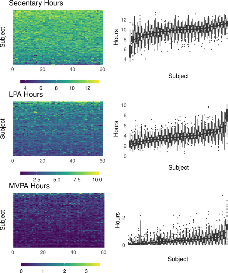
Fig 2. Activity metric distributions in the motivating data set.
The left column of panels shows the heatmaps for each metric and participant over the 60 days of observation included in the present analysis. The right column shows boxplots of sedentary, light, and MVPA time for each participant over the course of the study, sorted based on the median value for each metric separately. Individual boxes show bars at the median value, hinges at the 25% and 75% quantile, and whiskers extending to observed values within (hinge ± 1.5 * IQR). Data points outside the range of whiskers are shown.

