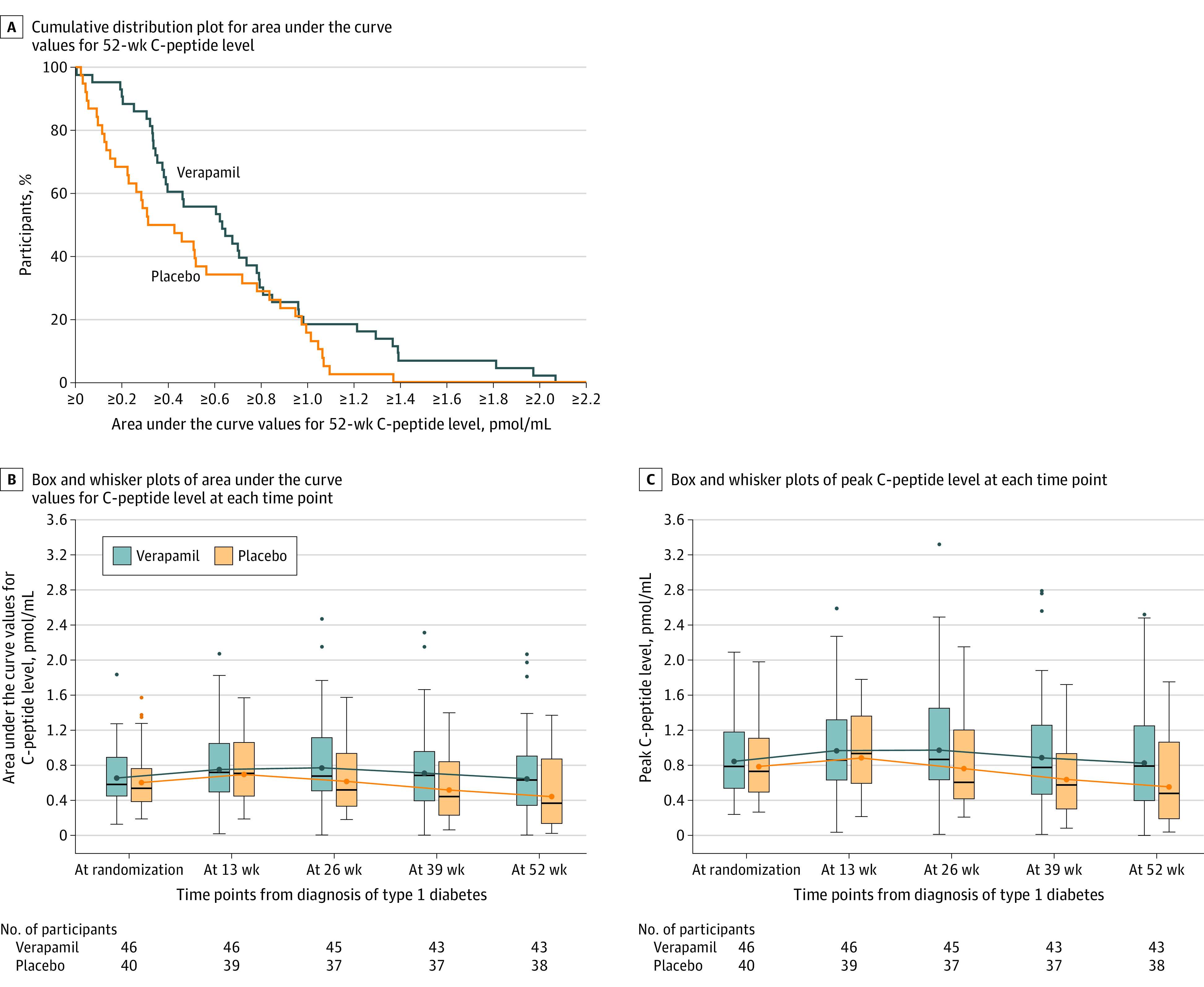
Figure 2. Area Under the Curve Values for 52-Week C-Peptide Level, Area Under the Curve Values for C-Peptide Level at Each Time Point, and Peak C-Peptide Levels at Each Time Point.

In A and B, the area under the curve values for the C-peptide levels were obtained from a mixed-meal tolerance test and computed using the trapezoidal rule as a weighted sum of the measurements for C-peptide level at time 0 and after 15, 30, 60, 90, and 120 minutes. In A, for any given C-peptide area under the curve level, the percentage of participants in each treatment group with a value at that level or higher can be determined from the Figure. In B and C, for each box and whisker plot, the blue or orange dot inside the box represents the geometric mean, the horizontal black line represents the median, the ends of the box represent the 25th and 75th percentiles, and the whiskers represent the highest or lowest values within 1.5 × the IQR. The numbers beneath the x-axis reflect the number of participants in each group completing a mixed-meal tolerance test at each time point.
