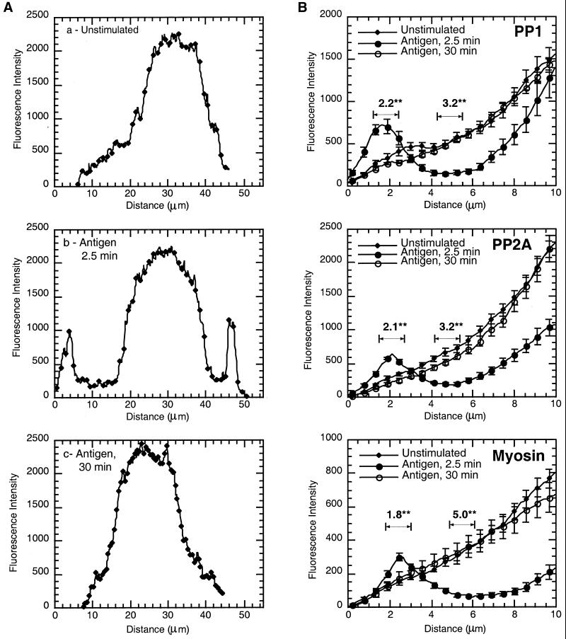
Figure 3.
Fluorescence intensity graphs of antigen-stimulated cells. NIH Image was used to generate fluorescence intensity data from immunostained cells as depicted in Figure 2. The line across the cells immunostained with PP1c (Figure 2B, a–c) was used to generate the fluorescence intensity graphs from unstimulated cells and those stimulated with antigen for 2.5 and 30 min (A, a, b, and c, respectively). (B) Area between the edge of the cell and the beginning of the nucleus. Three line measurements were taken from at least 10 cells and the data compiled as described in MATERIALS AND METHODS from cells immunostained with PP1, PP2A, and myosin. The data (mean ± SE) from unstimulated cells and those stimulated with antigen for 2.5 and 30 min are plotted together for comparison. Intensity graphs show symbol and error bar at every fifth data point. Numerical data above the graphs indicate the difference between unstimulated and 2.5-min antigen-stimulated cells at the peripheral band (fold increase) or the clearance (fold decrease). The significance of this difference is indicated (**p < 0.002).

