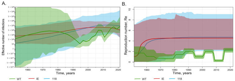
Figure 5.
SkyGrid reconstruction (A) showing the relationship between the effective number of infections (y axis) and chronological time expressed in years (x axis), and Birth–Death Skyline reconstruction (B) showing the relationship between the reproduction number of infections (y axis) and chronological time expressed in years (x axis). The curves indicate the mean, and the 95% HPD interval is shown by the shaded area. Graphs for wild-type HBV sequences are shown in green, for immune-escape HBsAg variants except T118A/V in red, and for T118A/V variants in light blue.

