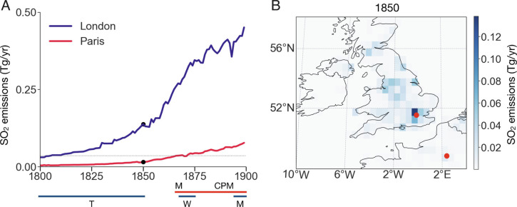
Fig. 2.
19th century sulfur dioxide (SO2) emissions in London and Paris. (A) Time series of emissions (17) in the grid boxes encompassing London (blue) and Paris (red). Years of paintings by Turner (T), Monet (M), Whistler (W), and Caillebotte, Pissarro, and Morisot (CPM) are indicated by horizontal lines for London (blue) and Paris (red). Emissions during Monet’s early paintings correspond to those of Turner’s early paintings. (The dotted black line represents mean Parisian emissions from 1864 to 1872). (B) A geographic distribution of SO2 emissions in 1850, highlighting how emissions are concentrated in London (red point in England) and that emissions in Paris (red point in France around 2°E) trail those in London.

