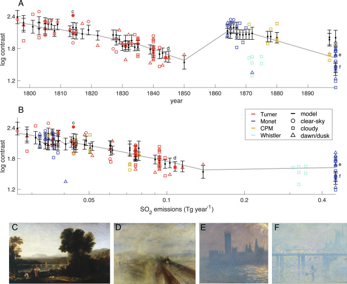
Fig. 3.
Trends in the contrast index for different subject matter in the 60 Turner paintings (red) and 38 Monet paintings (blue) versus (A) year or (B) SO2 emissions local to London or Paris. Also shown are six Whistler Nocturnes paintings (cyan), seven paintings by Caillebotte, four by Pissarro, and one by Morisot (gold). Paintings are categorized according to depicting conditions that are predominantly clear-sky (circle), cloudy (square), and dawn or dusk (triangle). Model predictions (black horizontal lines) are shown along with their 5 to 95% uncertainty (black vertical bars). Trends (gray lines) are illustrated by allowing year and SO2 to vary but withholding categorical fixed effect. Monet’s London paintings are plotted using 1899 London emissions because paintings were begun in the winter of 1899 to 1900, although exhibited in the following years, up until 1904. SO2 is plotted on a logarithmic scale. Also shown are four representative paintings: (C) Turner’s Apullia in Search of Appullus (1814), (D) Turner’s Rain, Steam, and Speed (1844), (E) Monet’s Houses of Parliament, Sunlight Effect (1899, in the Brooklyn Museum), and (F) Monet’s Charing Cross Bridge (1899, in Madrid’s Thyssen-Bornemisza Museum), with their values also highlighted in (A) and (B), as solid markers labeled with their panel letter.

