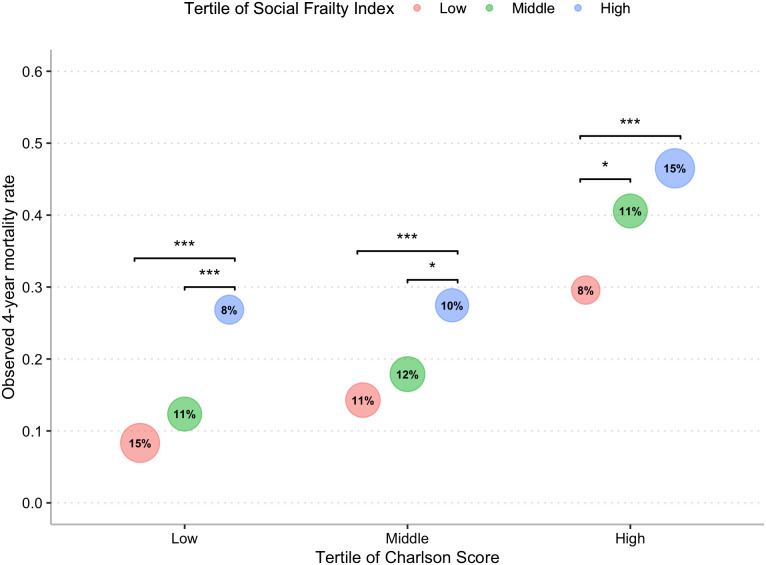
Fig. 3.
Observed mortality in 2012 validation cohort by Social Frailty and Charlson score. The bubble chart compares observed mortality in the validation cohort by tertile of Social Frailty within tertiles of Charlson score, a comorbidity risk model. The Charlson score cohort was calculated in a subset of the study cohort where 12 mo of Medicare data were available to calculate a Charlson score (2,226 of 3,948). Since the Charlson score does not include age, when comparing it with the Social Frailty Index, we remove age from the Social Frailty Index to provide a fair comparison. The area of each bubble is proportional to the total validation cohort that falls the specific group (e.g., 15% of the cohort has a low Charlson score and low Social Frailty Index score). Significantly different values are highlighted by a bracket. ***P < 0.001, **P < 0.01, *P < 0.05. Results presented in tabular form in SI Appendix, Appendix 7.

