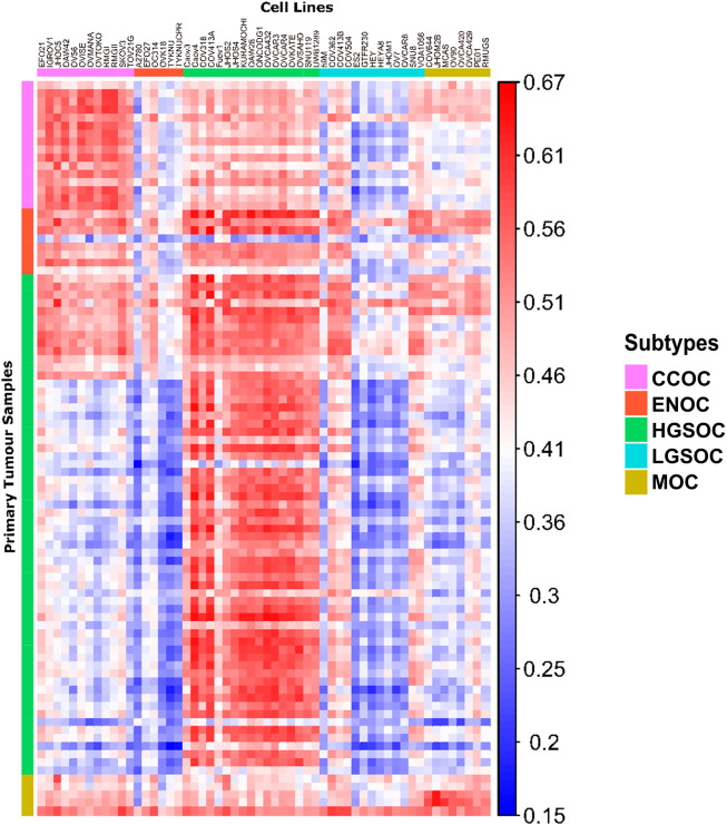
FIGURE 4.
Correlation matrix comparing similarity of cell line models to primary tumor tissue of each subtype. Each column represents a cell line, with the putative subtype assigned by NMF delineated by colored boxes (top). Each row represents a tumor sample, with the subtype of samples as identified by histological assessment shown by colored boxes (left). Each tile shows the correlation of gene expression between a cell line and tumor sample, ranging from 0.15 to 0.67 (blue to red).

