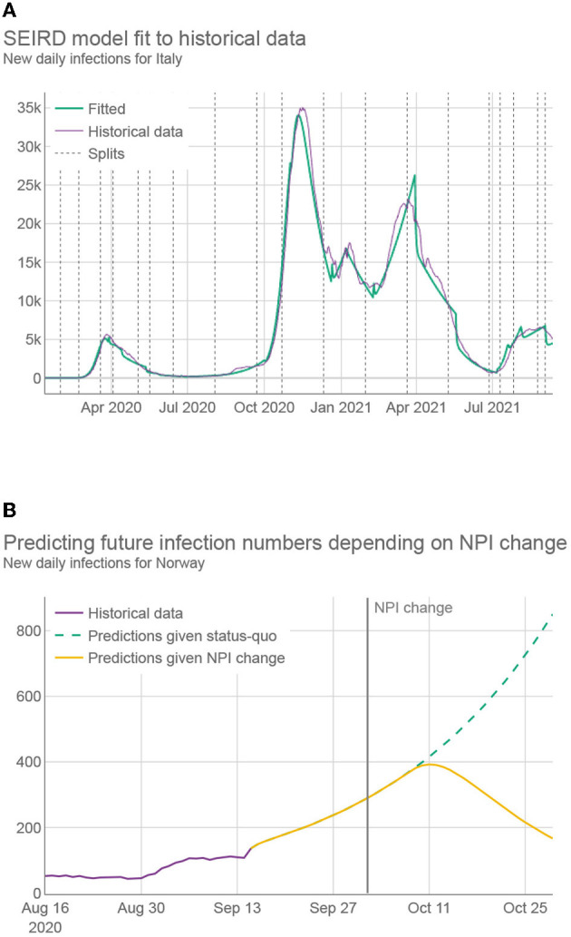
Figure 2.

(A) Daily infections for Italy over 20 months (purple) together with the predictions using best fitted SEIRD model (green). Fitting was conducted by first splitting the data into segments, represented by dashed vertical lines, where at least two NPIs were changed with respect to the previous segment. Different segments use different fitted parameters. (B) Daily infection predictions for Norway, made both by using only fitted parameters (green) and by using parameters adapted by machine learning, which reflect the change to more strict NPIs (yellow).
