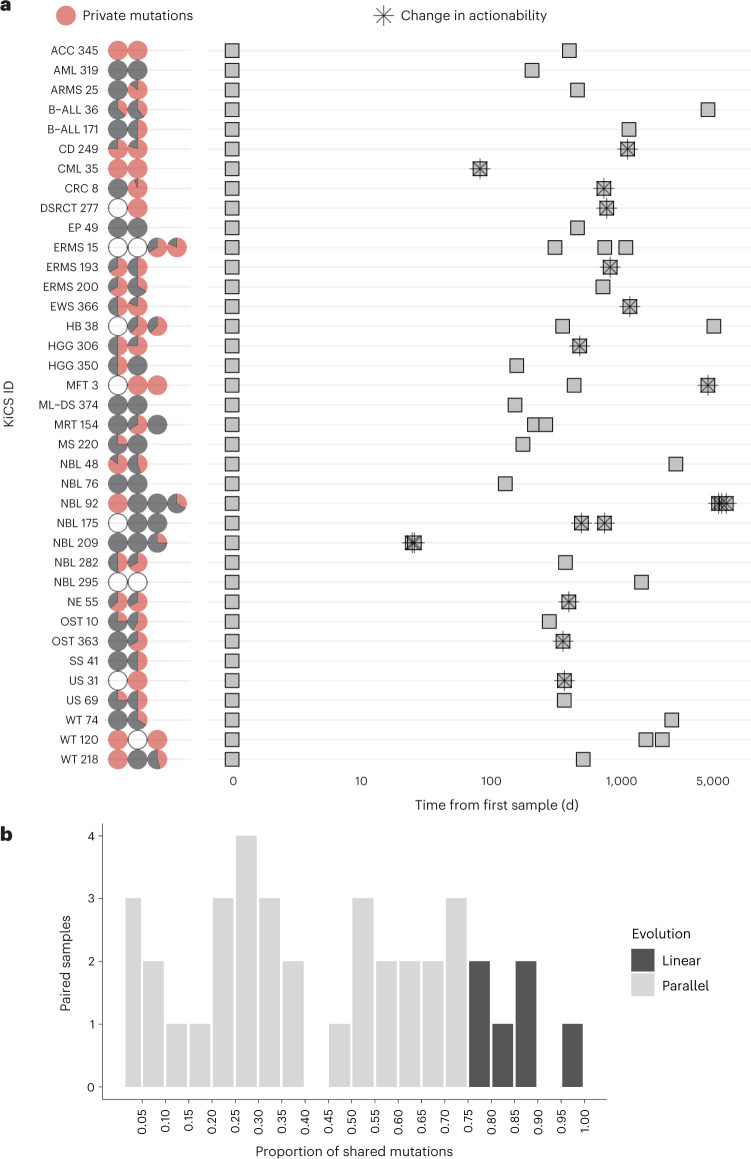
Fig. 6. Evolution of childhood cancers across time.
a, Each row corresponds to a patient with a single tumor diagnosis (n = 38 patients). Pie charts represent samples analyzed by cancer panel for each tumor where SNVs were detected at a VAF of greater than 0.10. Pie charts are colored by the proportion of mutations identified at each time point that were private to that sample (red) or shared with at least one other sample for that tumor, at a VAF of greater than 0.05 (black). Open circles represent no SNVs detected above the threshold. The center panel depicts samples (gray squares) in sequential order with time on the x axis, showing the number of days since the initial sample was obtained. A star represents the emergence or loss of a targetable driver, leading to a potential change in clinical action. Note that samples obtained at the same time point (days since diagnosis) correspond to anatomically distinct lesions (for example, local relapse versus lung metastasis). b, Proportion of mutations shared by each primary tumor with its paired relapse (n = 25 individual patients with 38 initial tumor–relapse pairs). Using WGS data, initial tumor samples were compared to relapse samples (with a one-to-one comparison comprising a ‘pair’). The proportion of SNVs from the initial sample shared with the paired relapse sample is characterized as parallel or linear on the basis of a 75% threshold29.

