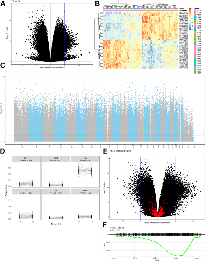
Figure 2.
Time-variant methylated positions. (A), A volcano plot depicting the mean difference in methylation between the 2 time points on the x-axis and the –log10(P-value) on the y-axis. (B), Heatmap visualizing the percentage methylation for the 25 most hyper- and 25 most hypo methylated DMPs. (C), Manhattan plot showing the chromosomal distribution of all Illumina HumanMethylation EPIC array probes. Each dot represent a single CpG locus; dots above the black line are statistically significantly different between T1 and T2 (FDR-adjusted P-value ≤ .05). (D), Estimated blood cell distribution stratified by time. Dashed lines connect samples obtained from the same donor. Statistical significance was calculated using a Mann-Whitney U test. (E), Volcano plot colored for age-associated CpGs. (F), Gene set enrichment analysis barcode plot representing the overrepresentation of the age-related CpGs among the time-associated DMPs.

