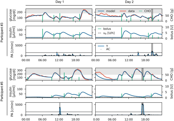
Fig 5. Data and personalized model for study participants #3 and #5 for two days each.
For each day, recorded (red) and fitted (blue) glucose data and carbohydrate inputs (green) are shown in the upper panel. Modelled insulin concentration (blue) and insulin inputs (green) including the basal insulin infusion rate (dashed) are shown in the middle panel. Accelerometer counts (dotted) and modelled PA intensity Y (blue) are shown in the lower panel with periods of physical activity highlighted in grey. The remaining participants are shown in Fig H in S1 File.

