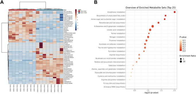
FIGURE 6.
Enrichment analysis of significantly changed metabolites. Heatmap visualization of 51 differential metabolites between the TASK+/+ and TASK−/− mice with a normal diet (A). Comparing TASK−/− to TASK+/+ mice, 22 of their metabolites were upregulated, while 29 were downregulated (Wilcoxon rank-sum test, FDR-corrected p < 0.05). A heatmap was generated using Pearson’s chi-squared test for distance measurement and the Ward test for the clustering algorithm. Colors on the heatmap indicate expression levels (red means high; blue means low). (B) The bubble plot displays metabolic pathway enrichment analysis of significantly changed metabolites from (A). The metabolic pathway was analyzed with MetaboAnalyst 5.0 using KEGG. A bubble’s size indicates its enrichment ratio. Colors indicate the significance of the annotated enrichment value based on a −log10 (adjusted p-value).

